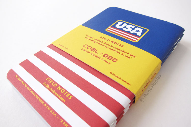
COAL × DDC edition of Field Notes is a special collaboration between Draplin Design Co., based in Portland, Oregon, and Coal Headwear, based in Seattle, Washington. In case you missed it, Aaron Draplin of Draplin Design Co. is the co-founder of Field Notes. I actually had no clue about this edition until it was mentioned in Pen Addict episode #111. As soon as I heard about it, I ran to my computer and placed an order. I believe the 3-packs sold out very quickly, in less than a week for sure. At the time of writing though, the 3-packs are still available as part of the COAL × DDC × USA Kit, which also includes a matching cap and an iron-on patch.
The notebooks were printed in January 2014 but they weren’t released for sale until mid-June, just in time for Fourth of July. Quite fitting for such patriotic colors!
Made in USA!
Silver staples
Things to note
Under the Specifications on the back inside cover, you’ll find colors that are used in the printing, and the colors are often named according to the theme of the edition. This edition is no exception. Names such as Wenatchee White and Yakima Yellow are references to places in Washington and clearly a nod to Coal Headwear, based in Seattle.
If you’re familiar with only the COLORS seasonal editions of Field Notes, you’d be interested in knowing that this limited edition is not printed by Service Graphics, Inc. in Illinois, which is the company that have been printing most of COLORS editions. COAL × DDC notebooks are printed by Stevens Integrated Solutions, in Portland, Oregon, the same people who printed the DDC Standard Issue in Sorta Jade.
And there’s an interesting spec on the back about scoring, that the cover was “painstakingly scored on 30" Rollem TR30 scoring machine.” I don’t think any information on scoring is usually included in other Field Notes, at least not in COLORS editions. Perhaps this is just a DDC edition thing because I noticed that, again, the DDC Factory Issue in Sorta Jade has the same bit of information on scoring.

Quick graph grid comparison: Original, Red Blooded, Coal × DDC, and Raven’s Wing (top to bottom)
Last thing I should note, and it’s unfortunately a negative one, is the innards. This edition uses Accent Opaque paper for both cover (100#C) and innards (50#T), and while I have no problem with the cover, the paper inside just doesn’t feel as smooth as the usual Finch Paper Opaque Smooth. I’m almost done using one notebook and overall, it has not been a pleasant writing experience. Maybe it’ll be adequate for quick lists or notes but for longer writing, I’m not sure if I’ll use another one. For reference, I use Pentel Energel 0.35mm; I only use gel pens with Field Notes.
Other than the paper quality, I’d say this edition is great. It certainly feels nice in your hands (I’m so glad the cover is matte!) with plenty of details to be impressed with.
Some fun (for me) details:
- Item number: FN-01
- Price: $11.95 per 3-pack
- Edition size: 5,000 printed in January 2014
- Cover: Accent Opaque 100#C in “Wenatchee White” printed with COAL × DDC × USA “Ballard Blue”, “Rainier Red” and “Yakima Yellow”
- Inside cover: printed with the same “Rainier Red” so that the text is white
- Cover: scored on 30" Rollem TR30 scoring machine
- Graph grid inside: COAL × DDC × USA “Puget Sound Gray” ink
- Paper inside: Accent Opaque 50#T smooth text in “Stevens Pass Whiteout”
- Belly band: yellow with red text
- Printed by: Stevens Integrated Solutions in Portland, OR.
- Practical Applications are the same as the ones in Original kraft notebooks. (edit: FALSE!)
- Also part of COAL × DDC × USA Kit, which includes a denim cap and an iron-on patch featuring the matching “USA” logo. Only 500 hand numbered kits made.
- Staples color: silver
My favorite "Practical Applications":
- #15. Trends Not To Follow
- #16. Couches to Crash On
- #19. Stitch Counts
- #26. Midday Coffee Orders
- #27. Gumby-isms
That yellow is very similar to the yellow in County Fair!

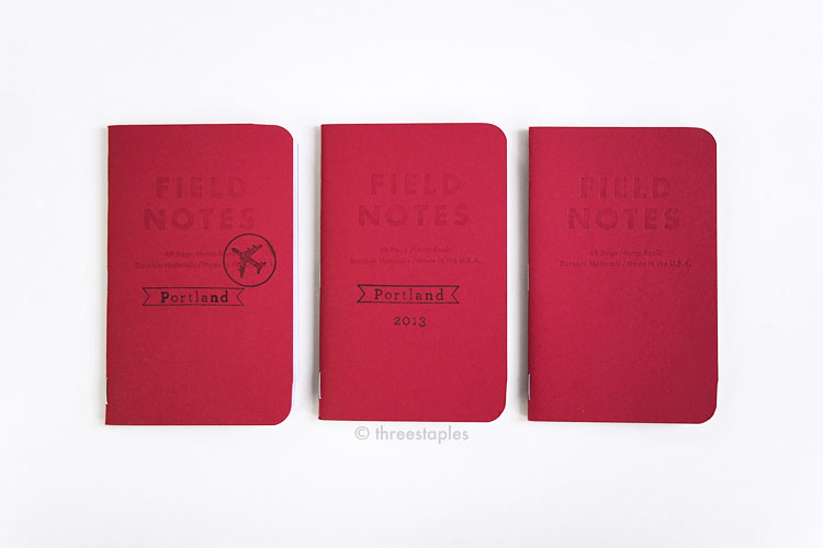
Quick red comparison: County Fair, Coal × DDC, and Red Blooded (top to bottom)