• Home
  • About
  • Journal
  • Archive
  • My Field Notes
  • Links
Menu

Three Staples

a stationery site by jinnie
  • Home
  • About
  • Journal
  • Archive
  • My Field Notes
  • Links

Field Notes Colors: Unexposed

October 2, 2014

The 2014 fall edition of Field Notes COLORS is called Unexposed, and here they are EXPOSED! Should I be providing a spoiler alert here? …Nah.

When Unexposed was first announced in early September, all we saw was a single image of a 3-pack wrapped in black. Mysterious! Turns out, that was the intention, to keep the content veiled until you open it yourself. The only information that was provided was that there were 6 different memo books available and that each 3-pack would have 3 random, different books among those 6. That would be a total of 20 different combinations. The suspense was exciting for me, and I tried to not browse any tags on Twitter and Instagram, until my own subscription mail arrived. I was glad that lucky folks who got their copies first were considerate enough and only posted pictures of their unopened packs. I was pretty successful in avoiding any spoilers, until I saw this tweet. Why did you retweet it so early, Field Notes, why?

Obviously, I didn’t try hard enough.

Black sleeve instead of a belly band

With sleeve open

Great contrast between opaque black and vibrant colors

Great contrast between opaque black and vibrant colors

Silver staples.

Silver staples.

Oh well, I still got a kick out of opening my own two 3-packs when they arrived because of their sheer shocking colors. I don’t think pictures can really capture how conspicuous they are. My initial reaction:

  • My eyes, my eyes! They hurt!
  • Thank goodness, they’re back to the original size. 
  • Darn, I’m missing one color. But not bad! 5 out of 6 colors!
  • Whoa, they did pink! I thought I’d never see it in COLORS.
  • Uh, there’s a registered trademark symbol on the covers now. 
  • I want to cut out belly bands out of the black sleeves. Just because.
  • Staples are better positioned in this edition. 
Colors for background and text are reversed inside each book. Blue book has blue text on pink background. Do not attempt to read the text.

Colors for background and text are reversed inside each book. Blue book has blue text on pink background. Do not attempt to read the text.

My eyes find these front three to be the worst offenders, the leftmost one (green book with orange inside) being the most painful, then the orange book (blue inside) and then the blue book (pink inside). Again, do not attempt to read these. Just don…

My eyes find these front three to be the worst offenders, the leftmost one (green book with orange inside) being the most painful, then the orange book (blue inside) and then the blue book (pink inside). Again, do not attempt to read these. Just don’t.

Backs!

From top: inside of pink, yellow, purple, green, orange and blue books.

Soft-touch coating is slightly less “rubbery” than Drink Local, in my opinion.

Soft-touch coating is slightly less “rubbery” than Drink Local, in my opinion.

Firsts

Unexposed is not the first edition to feature 6 different colors. National Crop (Spring 2012) and Drink Local (Fall 2013) are very notable earlier examples. Drink Local also beats Unexposed in getting the soft-touch coating. And Unexposed is not the first to feature reticle graph grid; we saw it previously on Night Sky (summer 2013). Additionally, this is the second time COLORS is printed by eDOC Communications, after Arts & Sciences (Summer 2014).

What’s interesting about Unexposed is that this is the first time in COLORS history where the colors were kept secret AND each pack is a random set of colors. I don’t know how I feel about that. It took me 3 packs to get all 6 colors. If I were to look at it glass half empty, the uniqueness of the edition was focused a bit much on the marketing aspect. The word gimmicky comes to mind. BUT! If I were to look at it glass half full, this edition is awesome because you get 6 new colors in one release. To quote the “Anonymous” Field Notes Enthusiast: Holy ████ !!

Best part of the Unexposed promo video: “Anonymous” Field Notes Enthusiast. :D (image captured from this video)

Best part of the Unexposed promo video: “Anonymous” Field Notes Enthusiast. :D (image captured from this video)

The anticipation before the reveal, the shock of the colors and the random factor... it was all exciting but the novelty of it doesn’t last very long, unless you really love neon colors.  I like them *shrug* (see how it ranks in my book). But I also don’t like soft-touch covers very much. I’m hoping the coating doesn’t turn into weird colors like it did in Drink Local. And I’m not going to get into the whole collectibility of this edition. There are many kinds of collectors, and thinking makes my head hurt, which it already is from these neon colors.

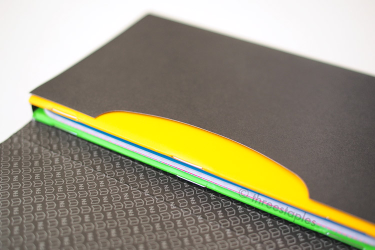
Moving on. Other noteworthy “firsts” in the COLORS series: the black paper sleeve, the ® mark, and the inks. Did you see the pattern inside the black sleeve? Isn’t that sick? I want it as a wallpaper. Like, real wallpaper around my humble Field Notes shrine. And the ® mark on the cover? It is hard to miss. Quick search at US Patent and Trademark Office (not linking it. I’ve had to deal with this site a few times before. One of the worst sites EVER) leads me to believe that they finally got it registered this year, and I understand why it’s added. Visually, it’s going to take some time for me to get used to. You can spot it on the inside and outside cover on the back, too. So tiny! Don’t strain your eyes!

This is the first time in COLORS that we’re seeing Sappi McCoy paper for the covers and Saphira inks, which are used on both the covers and the innards. You might call me a party pooper or a cynic but I do appreciate Field Notes trying new things. Like new printers, new papers, new inks. New fluorescent inks. How the heck do you even make these.

No doubt Unexposed is a fun and special edition, not to be missed by any Field Notes fan. The original size format is back and with the soft-touch coating, it's even more portable. It might even be an awesome conversation starter. But if my house was burning down and I had a split second to grab a pack of FN, Unexposed would not be my first choice. Except, maybe it might be the only one I can spot?

Hey, what’s that ® thing doing there?

Hey, what’s that ® thing doing there?

Reticle graph comparison: Unexposed (top) is slightly lighter gray than Night Sky (bottom).

Reticle graph comparison: Unexposed (top) is slightly lighter gray than Night Sky (bottom).

Some fun (for me) details:

  • Unexposed (Fall 2014) is the 24th in the COLORS series.
  • Item Number: FNC-24
  • Edition size: 60,000 books printed in August 2014. Does that mean 10,000 per color?
  • Cover: Sappi McCoy 100#C in Silk White with soft touch-coating, printed in six different fluorescent, soy-based Saphira inks. Each book is printed in two colors (reversed on inside covers):
    • blue book with pink text
    • pink book with yellow text
    • yellow book with purple text (see the pattern so far?)
    • purple book with green text
    • green book with orange text
    • orange book with blue text
  • Paper inside: Finch Paper Opaque Smooth 50#T in “Bright White”, the usual
  • Reticle grid inside: Pantone Cool Gray 2 soy-based Saphira ink
  • Belly band: none. Black paper sleeve instead.
  • Staples color: silver
  • Film: Field Notes COLORS Fall 2014 Edition (bleep!)

My Favorite “Practical Applications”:

  • #03. Neon Sign Sketches
  • #11. Hungrybear9562 Quotes
  • #26. Favorite Phosphorescents
  • #27. Minds Blown

Which out of 6 colors is your favorite? It’s a toss-up between the pink and the purple one for me.

Quick green comparison. From left: Balsam Fir, Day Game, Grass Stain Green, Soybeans from National Crop, neon green from Summer Camp. Unexposed’s green is more neon than Summer Camp’s green!

Quick green comparison. From left: Balsam Fir, Day Game, Grass Stain Green, Soybeans from National Crop, neon green from Summer Camp. Unexposed’s green is more neon than Summer Camp’s green!

In Field Notes Colors Tags field notes, unexposed, colors, blue, purple, green, orange, pink, yellow, black, fall edition, reticle grid, eDOC Communications, sappi mccoy, silver staples, no belly band, neon, fluorescent, soft-touch coating
Comment

Japan 2013 Stationery Haul

September 27, 2014

A Japan trip has been on M’s and my mind lately, so I decided to look back at stationery goods we purchased on our last trip to Tokyo. Turns out, we didn’t buy that much, compared to our previous trips. Probably because we were constrained by time and stationery shopping was not one of our primary goals of the trip. This was before we started getting into fountain pens after all. Yeah, that's probably it.

We had a few items in mind before the trip, though. First and foremost was M’s favorite notebook, L!FE spiral notebooks. My shopping list, on the other hand, was more vague. I knew I wanted some mt washi masking tapes for sure but I also wanted something whimsical, with characters on them like Miffy or Totoro, and anime goods for the fun of it. They tend to be hard to find and way overpriced here, so why not pick some up while in Japan? I had no idea what those would be exactly but I sure found many options once I got there. Anime stuff isn’t pictured and I won’t get into them here but basically many of my purchases ended up being of the stationery variety. Smaller, useful, and easier to pack. No giant stuffed Totoros for me (anymore)! :D

L!FE notebook in B6

Pocket after the last page

One of our favorite stores for stationery is Delfonics at Parco 1 in Shibuya. That is where M discovered L!FE spiral notebooks with pocket in size B6 years ago. L!FE notebooks are available in the US but this particular design in size B6 is pretty elusive, and he’s a big fan of B6. If I were him, I would’ve stocked up, but his self-control is far superior than mine. He just got ONE. Can you believe this guy?

Taken at the hotel on day 1. Record-keeping! :)

Black and red ball-point pen

I got my fix of character goods as soon as we arrived at JR Tokyo Station, at Miffy Style on Tokyo Character Street, which is inside the station. There were so many character goods stores there, it was overwhelming. I just focused on one store and declared done after buying a couple pens and a roll of tape. Maybe I met some sort of a purchase minimum but they threw in a pair of wooden clips as a bonus, all in a cute shopping bag. Score!

The pen with the pink tip and the ears is a ball-point multi-pen with black and red inks. One ear can be pushed down for black, the other ear for red. I don’t use ball point pens much anymore but it was too cute to pass up. The ink flows pretty smoothly but the way the pink tip  squeaks occasionally reminds you that the material is indeed cheap plastic.

Doesn’t this pen look like a Zebra Sarasa Clip? I bought it assuming it was but nowhere on the label does it mention Zebra. The refill inside says Zebra on it though, so I’m just going to assume it is Sarasa. It looks identical to a regular Sarasa and sure writes like one!

Decorative tapes

Midori envelopes and striped/clear bags

Our other favorite stores to hit while in Tokyo are Spiral Market and Itoya, where I was able to find these mt washi tapes. Spiral Market is a spacious and relaxing place to shop, not just for stationery but also for kitchenware, table linens, and general home goods. Itoya, as some of you may have heard, is stationery lovers' heaven. We didn't have time to go to the Ginza location, so we stopped by the one inside Midtown (our general shopping destination of choice anyway). That's where we found some fun sets of bags and envelopes by Midori. The tan envelopes with button & string closure are trompe l'oeil. They’re actually a pad of tear-off sleeves with an image of the traditional manilla folder. Ha! I have since found them locally in different designs.

Postcards from Nezu Museum. Some sent to friends.

Small, white folder and postcards + museum ticket

The postcards are from Nezu Museum. They are beautifully designed and the printing quality is awesome. The plastic folder came in useful for keeping tickets and receipts during the trip. I still use it today! It features an image of one of the museum’s highlights, an ancient bronze vessel in the shape of two sheep. We quite liked the museum store. It felt like a natural extension of the museum, a serene and quiet space to browse and soak in everything you’ve experienced. Can't say the same thing about many other museum shops. If you are in Tokyo and are into design, make time for Nezu Museum! And I haven’t even shown you its wonderful garden in the back.

Last but not least, here is a single Muji pen I bought in Japan, an erasable pen in 0.4mm. Yup, just one pen. An impulse buy at Muji To Go during our last-minute shopping spree at Kansai Airport. I hadn’t seen it at my local Muji, so I had to give it a try. It’s my first erasable pen, so I have no idea how it compares to others in the same category. But it writes smoothly and erases cleanly. I wish the ink was a darker black but I assume that’s just the nature of erasable inks in general.

以上です。That’s it!

Almost a year has passed since the trip and we’re still going through these purchases. We didn’t go too crazy, did we? I like that whenever I pull these out, I think of our trip and remember the places we visited.

On the list for our next trip are Loft, Tokyu Hands, Édito 365 and Wrapple. And we are going to add more to the list, after we study these magazines on stationery. It's going to be EPIC. Have you done stationery shopping in Japan? If so, what are your favorite places to shop?


In Travel Tags pens, gel pens, japan, travel, shopping, washi tapes, notebooks, postcards, muji, midori, miffy, zebra sarasa, L!FE, tokyo, folders, envelopes, mt tapes
3 Comments
← Newer Posts Older Posts →

WELCOME

I’m Jinnie!

✿(。◕‿◕。)☆彡

Twitter: @threestaples

Instagram: @threestaples

Subscribe: RSS


COPYRIGHT

© 2014–2020 Three Staples. All Rights Reserved. Please DO NOT use any part of this site, especially pictures, without permission. I’m being serious. Please see ABOUT page for details. 


Field Notes by Theme

Field Notes Item Numbers


LEGIT “PRESS”

February 2015 was HUGE for me, you guys. I got some shout outs directly from Jim Coudal and Field Notes.

And another one!

Thanks for that. :)


LATEST ENTRIES

Featured
threestaples-FN-IGpolls-Wilco2019-00.jpg
Nov 15, 2019
Field Notes: Instagram Polls (Part 6 - Wilco)
Nov 15, 2019
Nov 15, 2019
threestaples-fn-ccomp-ggray-P9044884-main.jpg
Nov 4, 2019
“Grout Gray” Field Notes
Nov 4, 2019
Nov 4, 2019
threestaples-PA165046-hangers1.jpg
Oct 18, 2019
Field Notes DIY: Non-slip hangers with Bands of Rubber
Oct 18, 2019
Oct 18, 2019
threestaples-FN-IGpolls-NationalParks2019-00.jpg
Oct 15, 2019
Field Notes: Instagram Polls (Part 5 - National Parks)
Oct 15, 2019
Oct 15, 2019
threestaples-FN-IGpolls-Summer2019-00.jpg
Oct 11, 2019
Field Notes: Instagram Polls (Part 4 - Summer Editions)
Oct 11, 2019
Oct 11, 2019
threestaples-FN-IGpolls3-00.jpg
May 21, 2019
Field Notes: Instagram Polls (Part 3 - Mile Marker)
May 21, 2019
May 21, 2019
threestaples-FN-IGpolls2-00.jpg
Mar 26, 2019
Field Notes: Instagram Polls (Part 2 - Spring Editions)
Mar 26, 2019
Mar 26, 2019

Archive
  • November 2019
  • October 2019
  • May 2019
  • March 2019
  • July 2018
  • June 2018
  • May 2018
  • April 2018
  • March 2018
  • February 2018
  • January 2018
  • December 2017
  • November 2017
  • October 2017
  • September 2017
  • August 2017
  • July 2017
  • June 2017
  • May 2017
  • April 2017
  • March 2017
  • December 2016
  • November 2016
  • October 2016
  • September 2016
  • August 2016
  • July 2016
  • June 2016
  • May 2016
  • April 2016
  • March 2016
  • February 2016
  • January 2016
  • December 2015
  • November 2015
  • October 2015
  • September 2015
  • August 2015
  • July 2015
  • June 2015
  • May 2015
  • April 2015
  • March 2015
  • February 2015
  • January 2015
  • December 2014
  • October 2014
  • September 2014
  • August 2014
  • July 2014
  • June 2014
  • May 2014
  • April 2014
  • March 2014

MY WISHLIST

  • Gimme all of these. Stat.


Some Amazon.com links on this site may be affiliate links, which means: if you follow these links and make a purchase, I will receive a small commission. You will not pay more by clicking through these links. Every little bit will help fund the hosting of Three Staples, so your support would be greatly appreciated. Thanks!


Copyright © 2014–2020 Three Staples. All Rights Reserved. Please do not use any part of this site without permission.