Important update:
Please be advised, Pilot Pen Station featured in this old blog post has since CLOSED! It sadly closed in 2016.
Hello! It's been so long! Happy New Year!
M and I recently went to Japan and did some major stationery shopping. Do I have stuff to talk about! But first, as promised on Twitter, here are some pictures and thoughts on our visit to Pilot PEN STATION Museum & Café.
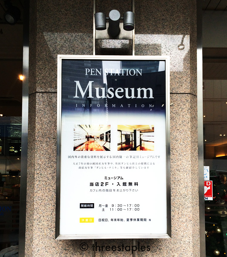
PEN STATION is comprised of a café on the ground floor and a museum on the second floor, at Pilot's corporate headquarters in Tokyo's Kyobashi neighborhood. Did we know this before we went to Japan? Nope! That's what's really neat about this part of our trip, that it was totally unplanned. We were in the neighborhood for something else when the familiar Pilot logo caught our attention from across the street. Pen museum?!? Sign us up! And free admission? Awesome. We ignored the (crowded) café and headed straight up to the 2nd floor.

As we guessed, the museum featured many of Pilot's pens in chronological order. It also had a couple videos and displays that explain how various types of pens work, how fountain pens are manufactured, how their Maki-e pens are made, etc. All in all, quite an educational place. By the way, I apologize for the low quality of these snapshots (no flash photography allowed!). I tried to focus more on soaking everything in, rather than taking great photos. Plus, most of the descriptions were in Japanese only. That takes effort to read. :D
The atmosphere of the museum was actually pretty nice and relaxing, I thought, with rich, shiny wood floors, glass everywhere, some artworks made with Pilot pens, and café tables. It wasn't crowded at all when we went. We noticed there was a large desk at one end of the main room where a couple people stopped by to talk to a Pilot representative. Huh! I learned later that you can get your Pilot pens repaired there. Cool!

While there, I really wished I was more experienced in fountain pens to appreciate all the pens on display. I'm a total n00b, so I didn't really know which pens to pay particular attention to. They all looked cool to me! I'm sure there were many pens pen addicts would drool over because there were several “Not for sale, display only” signs. Like this one:


Hey! I spot Pilot MYU 701! (right below 1971)
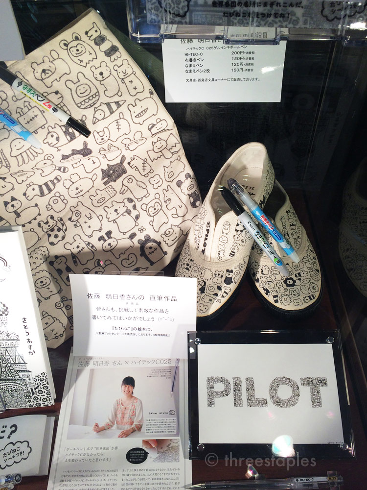
Satow Asuka is one of the artists featured at the museum who uses Pilot pens. There were some incredibly detailed artworks by her, made with her favorite pen Hi-Tec-C. And check out those whimsical shoes! (Hey, I have that Namae pen! It's sort of like Sharpie. Does that mean I can draw like her?!?)
The main takeaway for us from this museum was testing all the Iroshizuku colors. Next to the service desk, off to a corner, was a set of short fountain pens, each loaded with an Iroshizuku ink, and pads of paper. We later learned this is not unique to this museum (I think it was at Itoya where we found a similar sampling corner) but it was nevertheless a very memorable experience. Like I said, this was a random find, only on our 2nd full day in Tokyo! Anyway, we had fun testing each color, especially M because he's more of a fountain pen user than I am and had just gotten into Iroshizuku inks.
Stairs leading up to the museum
I think even if you don't know Japanese but love fountain pens or are a fan of Pilot, PEN STATION is worth a visit. Especially if you're going to be in the neighborhood anyway. It's in a more business-y neighborhood though, with many corporate office buildings. What were WE in the neighborhood for? There was a chicken yakitori restaurant (Isehiro) and a chocolate café (100% Chocolate Café) we really wanted to try. They both turned out to be great, especially the chicken place.
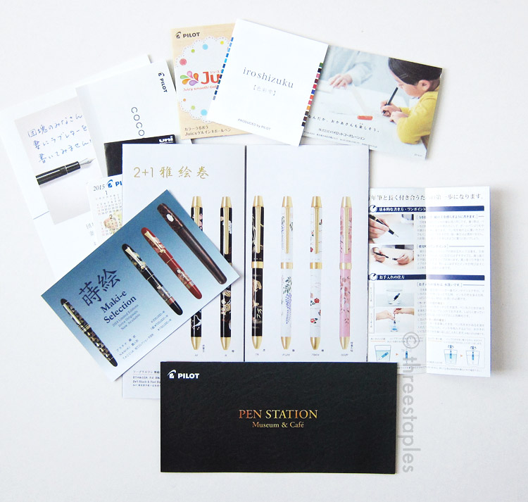
Various brochures I picked up at the museum, as any stationery nerd would do, right?

Pieces of paper with Iroshizuku colors we tested at the museum. That helped us make ink purchases later in the trip. :)
Here is the link again to the museum's official website with more detailed information: PEN STATION Museum & Café
In case you missed the note at the very top, Pilot Pen Station is CLOSED.