It’s been more than a month since I shared my journaling set-up and how it’s going to change in the new year, so I thought I would post an update on how things have been.
As planned, I am using both Hobonichi and Field Notes regularly. Hobonichi is the biggest change in my journaling habit. Maybe it’s still the honeymoon phase but I really like it so far. My plan was to use it to boost my creativity, and for that, it’s been working well.
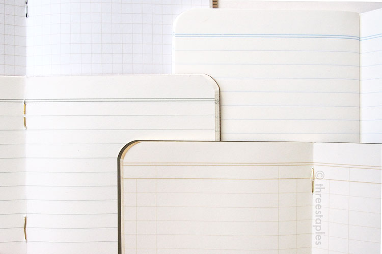
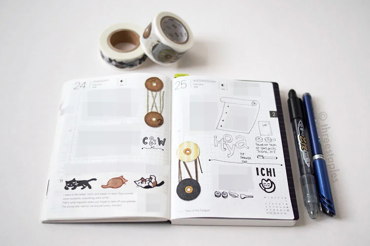
But I learned that the pages in Hobonichi are often not big enough to accomodate what I used to write in Field Notes every day. The tools I use for Hobonichi include washi tapes and rubber stamps, and they can take up quite a bit of space. So I can’t write many long, personal thoughts in it as I sometimes want to do. An illustrated journal is already pretty personal but sometimes I need to sort and think things through by writing out many, many sentences.
I also learned that I prefer to give each day a bit of space before I reflect on it. That helps me exercise my memory and focus on only the positives. So I end up writing in Hobonichi only every 2–3 days. Also, I want each spread in Hobonichi to look uniform, so I often end up working on two days at a time with similar colors and tools.
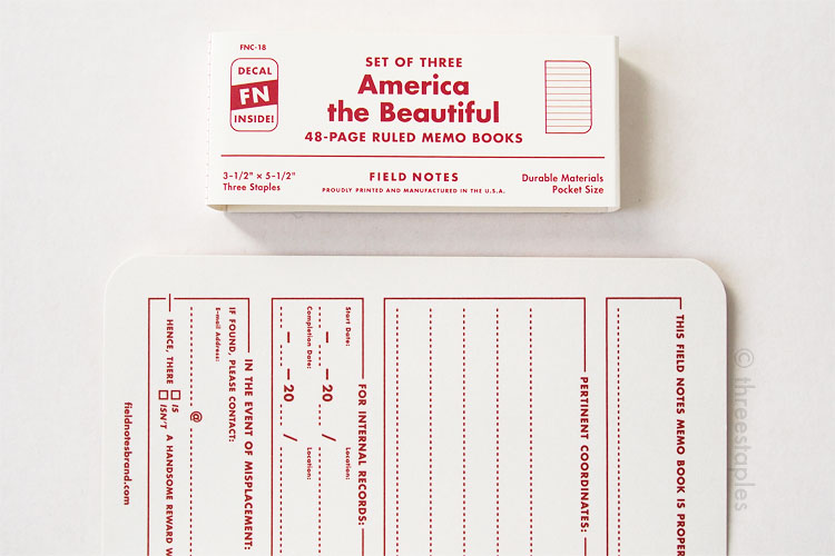
Which brings me to Field Notes. Since I don’t write in Hobonichi every day, Field Notes resumed the duty of recording my more lengthy thoughts and ideas daily. I thought I would use them only for quick lists but perhaps old habits die hard. But that’s okay; I decided to not limit myself to only one Field Notes per month, so I can freely write however much I need to daily. Any reason to use more Field Notes is fine by me! I suppose I could size up to Hobonichi Cousin for more space,too, but I don’t want to. I like the compact size of the original Hobonichi, and I want to keep the constraints it provides me.
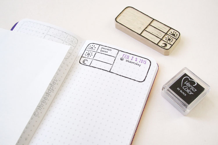
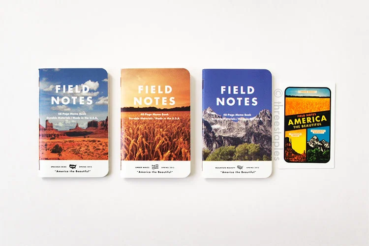
Still using Field Notes! Now with handmade rubber stamp for things I write daily.

So far, I’m happy that I added Hobonichi to my daily routine. It’s definitely a time-consuming commitment but I really enjoy and value the time I sit down with it. I get to exercise parts of my brain that have been lazy for so long. It’s rekindled my old hobbies, e.g. rubber stamping, as well. The goal was for me to get creative again, so in that respect, Hobonichi has definitely helped me jumpstart my efforts.
I’m sure there’s room for improvement in my set-up but I’m content and comfortable with it. I tend to take a really long time to form habits, so I’d prefer to have it evolve naturally, however arbitrary or backwards any changes may seem.
Are you a Hobonichi freshman like I am? How do you like it so far?