
Spoiler Warning
If you have not seen or received your Two Rivers, I recommend you wait before scrolling down, for maximum fun. Also, this post is very image-heavy. (●^口^●)
When I heard Jim Coudal “hyping” the spring edition of Field Notes Colors on the Inquisitive podcast, I was super excited. I tried to guess what they could possibly do this time to make the them totally different. Glow-in-the-dark inks? Easter colors? Ha! I would’ve never guessed in million years what they came up with, but once I saw Two Rivers and how it was inspired by and created to help Hamilton Wood Type & Printing Museum, the concept made perfect sense to me. Maker of analog tools with passion for printed words + keeper of American wood type printing and history = 💡💡💡
The sale of each 3-pack of Two Rivers benefits the Hamilton museum, located in Two Rivers, Wisconsin, with Field Notes donating $2 per pack. (You can also make donations separately, when you are checking out from the Field Notes website. When you do, you get a nice Thank You note). If you’re into letterpress printing, you probably have heard of the museum before and their efforts to preserve the American design and printing history. I won’t go into too many details; their website and the Field Notes edition page can explain much better the museum’s mission and what they offer. Also, I claim this as a required reading for any Field Notes fans! Go read the museum director Jim Moran’s post on how the collaboration came to be (the idea going way back to 2011!) and his printing journey. Loads of behind-the-scenes pictures give us valuable insight and appreciation for these little memo books, too. Be sure to watch him and Aaron Draplin talking about the edition here, as well.

Team effort. How cool is that the code name for the project was “The Portland Project”?

Familiar faces from the Field Notes crew! (screencap from the official Two Rivers video).
Handmade
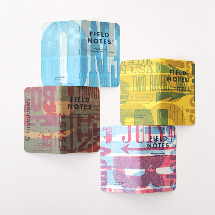
Two Rivers is easily the most handmade edition among the recent Field Notes Colors. Each cover features 2 different designs, out of 7 designs that were hand-set by Aaron Draplin, Bryan Bedell, and Matthew Jorgensen of Field Notes. The covers are actually hand-printed by the Hamilton Museum director himself with the help of the Assistant Director, Stephanie Carpenter. Their old printer had to be nursed back to life with the help of experts and constantly maintained, and even with printing through nights and weekends, volunteers and interns had to pitch in. Sounds like this was an all-hands-on-deck sort of project, doesn’t it?
With many people’s efforts and time that had to be put in, it’s no wonder the edition size is slightly smaller this time, at 25,000 packs (Ambition, the previous edition, was 30,000 packs). Still, that’s no small amount, and I hear Two Rivers almost became a summer edition instead of a spring edition, because of the time involved. Perhaps this is why we haven’t seen a hand-printed Colors edition in a while. (The last one was Fire Spotter, back in Fall 2011, with only 12,000 books). It must be getting too expensive and time-consuming, as Field Notes continues to grow and edition sizes get bigger.
I love letterpress and its tactile quality, so I’m glad Field Notes didn’t abandon the idea. When I finally got to hold Two Rivers in my hands, I was instantly impressed. I’m enjoying all the little details that come with hand-printing, including variations in the texture and the extra ink smudges on the inside covers. Not to mention, the ink smell! It has mostly faded by now but it was still a nice reminder of how they were made. Hopefully this is not the last time we see letterpress.

Another screencap from the official Field Notes Two Rivers video. Word.
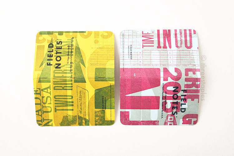
Four different cover colors, from top: Packing Brown Wrap, Sno-Cone, True White, Lemon Drop.
Copper staples of Two Rivers (front) and silver staples of Original (back).
Copper staples

Quick white cover comparison (from top): Day Game, Two Rivers, National Crop’s “Cotton.”
Firsts
Two Rivers is the second edition after America the Beautiful to get copper-colored staples. And we are no stranger to French Paper covers. Allow me to get more specific with the colors of the covers:
- The yellow cover in Two Rivers (Pop-Tone in “Lemon Drop”) was used previously in Packet of Sunshine (Spring 2010) and National Crop’s “Corn” (Spring 2012).
- The light blue cover (Pop-Tone in “Sno Cone”) was used in Just Below Zero (Winter 2009/2010).
- The kraft cover (Dur-O-Tone in “Packing Brown Wrap”) is used in the Original 3-packs of the permanent line, of course. In the Colors series, it was previously used in Day Game (Summer 2012), and Dry Transfer (Spring 2011).
- The white cover in Two Rivers uses French Paper Speckletone in “True White”; that is a first in the Colors series. But if you have the J.Crew edition (non-Colors), you might recognize it as the same stock. What about “Cotton” in National Crop, you say? That is Speckletone in “Starch White,” which is slightly whiter than the Two Rivers’ “True White.”
One is not like the others.
National Crop (far left) and Packet of Sunshine mixed in.

Belly band in matching dark blue and look who’s featured on the back!
The more impressive “first” regarding the cover paper is that they were donated by French Paper Co., in Niles, Michigan. There’s a nice and short video with Brian French talking about his company’s contribution to the cause. You can even spot their logo on the back side of the belly band; I think it’s their first appearance there!
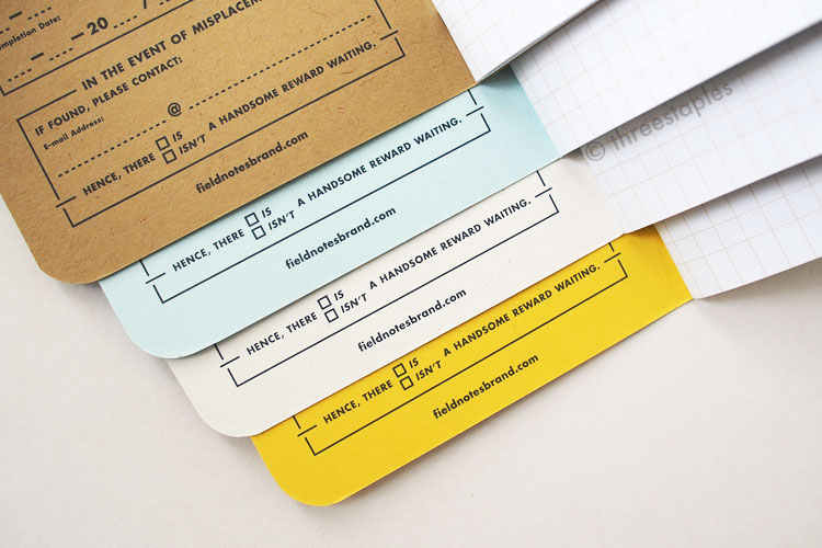
With the “forces from the Great Lakes coming together,” as Aaron Draplin put it, it’s fitting that the usual space for the “Practical Applications” on the back inside cover made way for a special paragraph on the Museum and the collaboration. The Specifications are longer and more descriptive, too. It’s not the first time “Practical Applications” are missing though. Neither Night Sky nor Arts & Sciences has them.

Just look at that glorious J, look at it!!!
But the most obvious “firsts” in Two Rivers, besides the donation aspect, are the randomness of the covers, which I’ll get into below, and the fact that the covers are letterpressed with wood type designs. We’ve seen non-solid designs before (America the Beautiful), but this is the first time in Colors that we see big, bold type designs on the covers. And earlier editions like Grass Stain Green, Raven’s Wing, and Fire Spotter were letterpressed by hand but I am pretty positive they didn’t use wood type. And the indents on them were deep, purposeful, and precise, whereas in Two Rivers, you see a range of depths in the impression of the (mostly) wood types. In some areas, you can feel the outlines of the design, where the wood pieces were pressed, and in some areas you can barely feel it. (Based on what I’ve learned, in the old days of letterpress, the purpose was to transfer the ink just barely, without making any indents). I love it either way. I’ll take whatever hand-printed Field Notes any day.

That's unmistakable wood grain showing through right there. Mm!
Mm, boy!
I'll stop?
Thousands of Variations
Each pack of Two Rivers contains 3 random covers out of thousands of variations. Unexposed had a bit of the random factor, too, but that edition had only 6 variations. This edition? You do the math because I won’t: 7 different designs printed on 4 different colors of cover stock, with 3 different ink colors. Oh, but wait: each cover sheet was printed with 2 of those 7 designs in 2 different colors of ink, and then cut in half to make two covers (“2-up”). And let’s not forget that the inconsistent nature of the wood type, letterpress printing, and the inking. All in all, we’re told thousands of variations were produced. According to the museum director, Bryan Bedell “wanted as many variations as possible.” Okay!
As a Field Notes collector, it might be upsetting but I’m not bothered by it (but then again, I never considered myself a hard-core collector). I knew I would never be able to “complete,” and this edition made it much easier for me to be at peace with that. I’m actually enjoying the randomness too much to be bothered by it. Every time I opened a new pack, which I couldn’t resist doing, I had a new favorite.
My favorites are definitely the ones with less “busy” designs with more harmonious color combinations. Many of my least favorites are the kraft ones with red and blue inks; they are too “camo” for me. This is why Two Rivers, as an edition, not individual notebooks, will never place in the top 10 of my Field Notes ranking. I love the concept behind it but considering strictly the random factor and the visuals, Two Rivers ranks somewhere in the middle for me.
But that doesn’t mean I won’t be tempted if I come across Two Rivers at a local store. If I see a variation I like, I can’t promise to exercise self-control.

Do you see the giant “BBQ!”? I could show you all the different design that can be pieced together but it’s probably more fun if you find out for yourself! Plus, I did not get all the different designs. That illustration of pig & cow and “farm” text? None of my Two Rivers has them (yet).

My top favorites so far.
The only kraft ones I like have big, bold designs.
Beautiful back sides.

The only pair that I have that ended up with the same two designs layered. But notice how they are aligned differently.

Variations not only on the outside covers. Notice the difference in the ink saturation.
Some fun (for me) details:
This where I usually add all the interesting specs found on the back inside cover, in a list format. Many of them are already mentioned so far but I will fill this section later, since this edition is still so new. Plus, I spent way too long on this post already. I might also add more opinions and insights later, after I spend more time with these notebooks.

DDC! The wood type for the DDC logo looks nice and new in the video!
P.S.: Remember Neenah Paper from County Fair, Raven’s Wing, and American Tradesman? They also helped in donating to Hamilton Wood Type last year, through the sale of letterpress prints at their Beauty of Letterpress website and matching grant. Definitely still worth checking out if you love letterpress. And best of luck to the Hamilton museum! I wish to visit it someday. And I actually wouldn’t mind seeing Neenah Paper again in Field Notes… hmm. :)
P.P.S.: I lied about not calculating. M and I did the math and came up with 1,008 total variations on the covers (does that sound right? Corrections encouraged!). Of course, it doesn’t take into account the unpredictable nature of hand-printing with an old printer. I believe Mr. Draplin when he exclaimed, “No book is the same!”
Nose-flaring “Stock up!” from Aaron Draplin. And I’m sorry I have more than 3 packs (subscription + 3 packs)? I swear I’m not a shady reseller or anything! >_<
