I started using the Field Museum Field Notes at the beginning of this month, and it reminded me that there are other Field Notes editions that use the same green paper stock, French Paper Pop-Tone in Gumdrop Green. So here they are all together (pictured above, from left):
- Shenandoah “Sweet Birch” (Fall 2015 Quarterly Edition)
- Grass Stain Green (Summer 2009 Quarterly Edition)
- The Field Museum (released late 2017)
There may be other Field Notes that use the same paper, but these are all I have. As you can see, I don’t have the original, plain white belly band of Grass Stain Green (I only have a single), but don’t they look lovely all together? I think that these light brown belly bands look especially great with the matte green covers.

Obviously, GSG stands out because it’s the only one that’s letterpressed (“blind hit” to be more specific). It’s one of the most beautiful Field Notes and certainly one of my top favorite editions, but so is Shenandoah, with its custom-duplex cover and brown ink that work together to complete the forest theme. The Field Museum edition may seem plain by comparison, but it’s still special to me because of all the memories I have of going on field trips to the museum when I was younger.

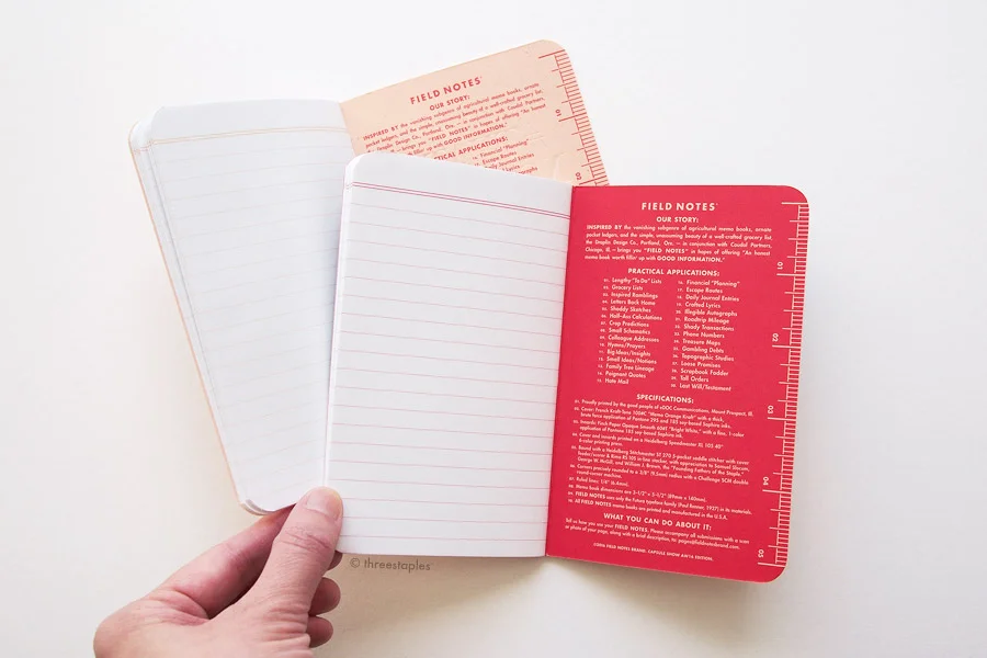
Back inside covers (from top): Grass Stain Green printed with “Green Mind” ink, Shenandoah “Sweet Birch” with “Shenandoah Salamander” brown ink, The Field Museum with “Lake Michigan Blue” ink.
All three editions use “Gumdrop Green” in 100#C for the cover, but Shenandoah feels the thickest because it is duplex-mounted to another sheet of paper, French Paper Pop-Tone in “Lemon Drop”, making it the only one whose cover looks different when you open it.
From top: Shenandoah “Sweet Birch”, Grass Stain Green, The Field Museum
From left: Grass Stain Green, Shenandoah “Sweet Birch”, The Field Museum
As for the body paper, they all use “white” paper, except GSG uses Boise Offset Smooth 50#T, which is what Field Notes used in the early days. Since Balsam Fir, they have been mostly using Finch Paper Opaque Smooth, which is what you’d find in Shenandoah and The Field Museum edition, both slightly thicker in 60#T. Both GSG and Shenandoah are graph grid (3/16"), printed in “Photosynthesizing Chlorophyll” light green and “Appalachian Moss” light green, respectively, while The Field Museum is ruled (1/4" or 6.4 mm) in “Double Knee Duck Canvas” light brown ink, the same color you’d find in Field Notes’ standard Kraft memo books. Fun (to me) side note: the inside cover of GSG specifies 4.5 mm for the grid size, but the conversion should’ve been 4.7 mm. I believe this doesn’t get corrected until National Crop (Spring 2012).

From top: Grass Stain Green, Shenandoah, and The Field Museum. Innards in Grass Stain Green are 50#T, making it the thinnest memo book in this group. Shenandoah feels the thickest with its custom-duplexed cover.

I like that these all have different sets of “Practical Applications”. The ones in GSG are not unique; they’re the same as the ones in the regular kraft books. But the other two have their own custom sets. Interestingly, there are only 15 applications in the Field Museum edition, and I admit I don’t recognize all the references. Maybe it’s time for me to revisit the museum. 😊
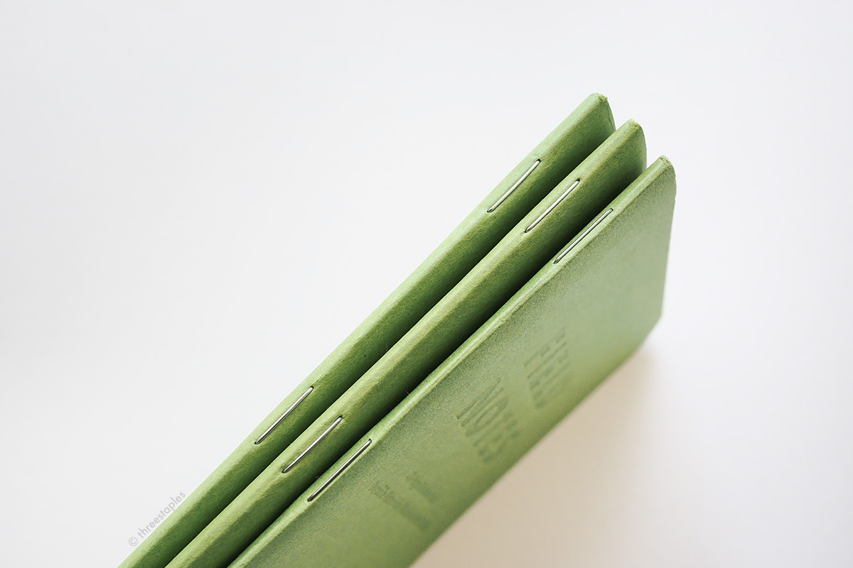
All have silver staples!

Back view, from left: Shenandoah “Birch”, Grass Stain Green, The Field Museum.
I’ve always been a fan of Field Notes memo books with French Paper Pop-Tone covers, so I was stoked when the Field Museum edition came out, even though “Gumdrop Green” has been used before (and despite the hefty price tag). It might not be exciting anymore to some fans, but I really like this green, and as a casual Field Notes collector, it’s fun to compare and see how the same paper is interpreted in different ways. Which do you like the best? I really like all three, but if I were offered extras of any of these (one can dream), I’d choose Grass Stain Green. 💚

Green color comparison
Related Links and Notes
- Field Notes Color Comparison: Green
- My previous post on Grass Stain Green
- My previous post on Shenandoah
- There’s a second set of The Field Museum Field Notes, with Earth as the theme! It is available online, here.
- The first version (the green 3-pack featured in this post) is now on sale, here.
- The Field Museum (Chicago, IL)