If you’re one of the Field Notes “collectors”, then you know that Capsule Show makes one of the more interesting, branded Field Notes memo books out there. And if you’re not familiar, Capsule is a fashion and lifestyle trade show, and every year or so, they’ve been giving out their own branded Field Notes memo books to their show attendees. I believe Field Notes has been showcasing their products at Capsule since 2009. Anyway, maybe they have a bigger budget than other companies, but these Capsule Field Notes often feature whatever new things the Field Notes folks are trying on their own quarterly, limited editions. I won’t go into all of them, but take the Capsule Autumn/Winter 2017 edition that came out earlier this year, for example. It features the same PUR binding found in Black Ice, which had just been released at the end of 2016 as Field Notes’ Winter 2016 edition. Or the Capsule Spring/Summer 2015 edition from mid 2014, with the same cherry wood veneer used in Shelterwood (the Spring 2014 edition), but with blue text on the cover. Pretty sweet, if you ask me.

Same paper in three different editions (left to right): Workshop Companion, Capsule SS 2016, Capsule AW 2016.
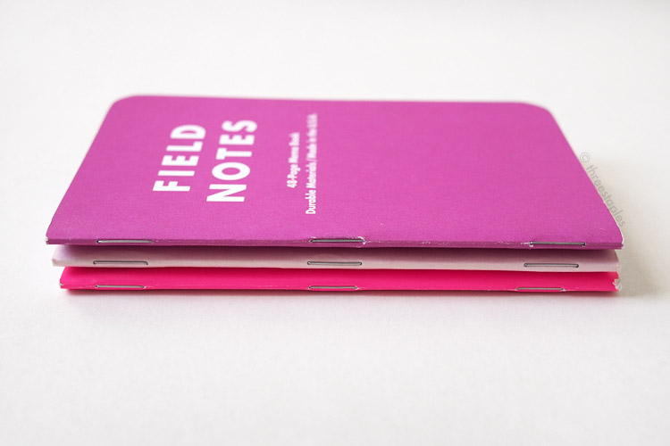
Another set of examples that show how “fancy” Capsule can get, and the focus of this post, are the Spring/Summer 2016 and Autumn/Winter 2016 editions. The SS16 edition is quite minimal and chic, with blind-embossed Field Notes logo on the front and the Capsule hashtag #thatnewnow, also embossed on the back. The AW16 edition has a beautiful photographic image of leaves that wrap around the cover in dark navy ink. Both editions are bound by gold staples and have ruled lines inside. And! As illustrated by pictures above, they both use the same cover stock seen in Field Notes’ Summer 2015 edition, Workshop Companion. Namely, French Paper’s Kraft-Tone 100#C in Memo Orange Kraft. Workshop Companion and Capsule SS16 are actually one of the firsts to use French’s new Kraft-Tone line when it came out in early 2015. Perhaps they were printed at the same time, to make things more time and cost efficient. And it’s interesting that Capsule went with the same cover stock for the following AW16 show, too. Maybe these were all made at the same time. Who knows? However it happened, I think the SS16 and AW16 editions make a nice pair.

Capsule SS16 (left) and Capsule AW16 (right).
This “Memo Orange Kraft” is a light, pale salmon or peach color, for lack of better words, and like other colors in the Kraft-Tone line, you can see little flecks and fibers in the paper (Kraft-Tone is 100% post-consumer recycled paper). I like that a lot, and the paper feels quite sturdy and hefty, too. I admit the color may not be my cup of tea, but I adore the AW16 edition. It’s truly one of the more unique and beautiful editions in my stash. (As far as I know, it’s only the second one to get “photographic” image on the cover after America the Beautiful from Spring 2013, followed by Nixon in 2016). Funny how with different colors and designs, the same paper can go from “okay” (Workshop Companion) to “wow!” (Capsule AW17).
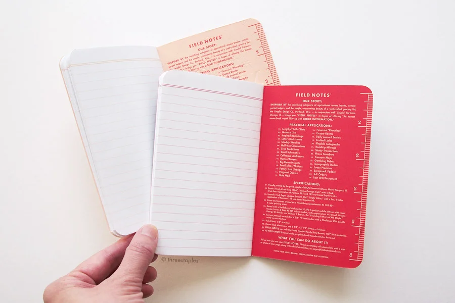
Inside covers of both Capsule editions are printed in red, except in AW16 edition (right), the “background” of the text is printed instead, so that the pale orange color of the paper shows through as the color of the text. This red in AW16 is Pantone 185, the same color used for the ruled lines.
Inside covers: Workshop Companion (top) with text in unnamed black ink, Capsule SS16 with “Capsule Red”, and Capsule AW16 (bottom) with Pantone 185. I wouldn’t be surprised if this “Capsule Red” was actually Pantone 185.
Innards comparison, from top: Workshop Companion with “Maple Lacquer” dot grid on French Kraft-Tone 70#T “Standard White Kraft”, Capsule AW16 with Pantone 185 ruled lines on Finch Paper Opaque Smooth 60#T “Bright White”, and Capsule SS16 with “Memo Orange” ruled lines on Finch Paper Opaque Smooth 50#T “Bright White”.

Workshop Companion “Electrical” (far left) with brass staples. Capsule SS16 (middle) and Capsule AW16 (far right) have gold-colored staples.

Back sides, from left: Workshop Companion, Capsule SS16, and Capsule AW16. The SS16 is embossed on the back.