This is the third and last post of a small series where I’ve been sharing my thoughts on Hobonichi and its Tomoe River paper. You can read the first post (on rubber stamping in Hobonichi) here, and the second post (on washi tapes) here.
I’m on my second Hobonichi Techo, which means I’ve been writing on its Tomoe River paper for quite some time now. It doesn’t mean I’ve been writing in my Hobonichi daily; there are days, even weeks, where the pages are blank. But I think I spent enough time with it so far to be able to finally talk about some of the pens I’ve tried, and highlight what worked and what didn’t work for me.
Note: In this post I use “TR” as an abbreviation for Hobonichi’s Tomoe River paper.

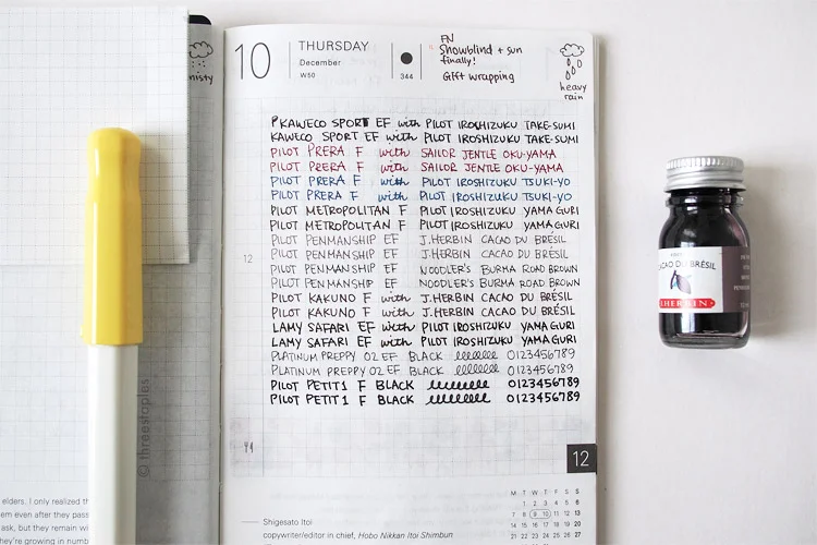
Testing various gel pens in the back pages of Hobonichi. This wasn't a scientific comparison by any means. It's simply to show what could happen if you don't wait for the inks to dry.
Gel Pens
One of the first things I learned from using TR paper is that I have to be very patient. Let the ink dry completely. Even when you think you’ve given it enough time to dry, it’s safer not to touch it. Because a little swipe with a fingertip (worse yet, a moist fingertip) can smudge the ink. Obviously, this depends on the ink formula, but surely I can put some of the blame on the TR paper’s characteristics. I mean, it’s so thin, yet the ink doesn’t bleed through! Where does the ink go if it’s not absorbed by the paper? Oh, it’s on the surface, taking forever to dry.
I’m sure seasoned Hobonichi users are saying “well, duh” by now, and it’s not like I haven’t heard that TR paper requires extra drying time. But some things are better learned through experience, I guess. I knew not to expect much from fountain pen inks, as most of them are dye-based and not waterproof. But I was disappointed to find that gel pens, too, require extra time and can be more sensitive to moisture, even the ones that never have these problems on regular paper. Some gel pens are better or worse than others. The Pentel Hybrid Technica, for example, smudges even after letting it dry for a long time. Thankfully, my favorite gel pen of all time, Pentel EnerGel Euro Needle-Point in 0.35 mm, is one of the better ones.
Another thing I learned is that I don’t enjoy the feel of gel pen tips when writing in my Hobonichi. I generally use finer tips (0.35–0.4mm), and these feel too pointy on the delicate TR paper. I tried using the plastic Hobonichi pencil board to add stiffness, but it made the writing surface feel too slick. This was really unfortunate for me, as gel pens are my primary choice in pens, and I really wanted to use them with Hobonichi. This is why, for awhile, I was unsure I would continue using Hobonichi in the new year.

Drawing Pens
But I didn’t give up! I experimented with drawing pens next, like the ever-popular Sakura Microns, Staedtler Pigment Liners, Pilot Drawing Pen, Uni Pin, etc. Since many of these are waterproof, I had no problems with them on TR. Once dried, I experienced no smudging. And along the way, I discovered a wonderful pen called Rotring Tikky Graphic Drawing Pen. I loved the feel of its tip on TR, its wet ink, and the dark red-brown barrel. I really enjoyed using it in Hobonichi… until the tip lost its crispness and became too wide for my taste. That seems to be the general problem I have with all the graphic liners I’ve ever tried (that, and also they’re uncomfortable to hold). So my search for a better Hobonichi pen continued...
Oh, one happy discovery I made is that Pilot Futayaku Double-Sided Brush Pen in black/gray ink is fantastic on the TR paper. The ink still requires a lot of caution and patience, but it doesn’t bleed through. Once it’s dried, it stays put. I especially like the gray tip; since the ink isn’t absorbed right away, you can push it around on the paper for a nice watercolor effect.
I’m still using drawing pens with Hobonichi; I just limit them to drawing, not writing. I make line drawings with a graphic liner (like Shaun the Sheep above!) and once they’re dry, I often shade them with the Pilot Futayaku gray ink.
Fountain Pens
I’ve heard plenty of people raving about how wonderful fountain pens are on Tomoe River paper, so that’s what I tried next for writing, despite knowing they’re not waterproof and that I’d have to be extra patient. I’m glad I didn’t give up because FPs are what I mainly use these days with Hobonichi. At first, I wasn’t exactly sure how to use my Hobonichi, but now that I’ve found a great fountain pen+nib+ink combo that works well on the TR paper, I’m journaling a lot more regularly.
My favorites are the Pilot Kakuno (F nib) with J. Herbin Cacao du Brésil ink. I’m not an FP expert, so I can’t say this is the best combo ever, but out of all the pens and inks I already own, it suits my needs the best. I really enjoy how the TR paper feels at the tip of my nib (without the pencil board), and I find Cacao du Brésil to be more resistant to smudging than other inks I have at home (e.g. Sailor Jentle Miruai). These properties alone could have convinced me to not give up on Hobonichi, but I absolutely love the color, too! It’s a warm gray with a hint of purple.
Since my handwriting is small, I normally prefer Japanese EF nibs (especially on a small grid like in the Hobonichi) but the EF I tried (from Pilot Penmanship) felt too scratchy. To balance out the wider F nib, the soft gray color of Cacao du Brésil keeps my pages from looking too dark or contrast-y. I’m tempted to try more gray inks but the small bottle I got looks like it’ll last me a long time. Good, because I want to feel “settled in” with my Hobonichi already!


So yeah! Thanks for reading this far! Hobonichi has been a great excuse for me to experiment with different pens and finally see for myself how TR performs. It’s tested my patience at times but I had fun most of the time and I learned a lot. I’m still enjoying it and I’m sure I’ll discover new favorite fountain pen inks as I go.
What are some of your favorites pens to use with Hobonichi?
Related Links
- Hobonichi Techo at Amazon.com
- A Practice: My Hobonichi Techo | From the Pen Cup: I find Mary’s “three good things” per day idea inspiring, as is Ian’s Journaling with Purpose | Pens! Paper! Pencils!
- What I Use: Hobonichi Techo Journal | Fountain Pen Quest: take good note of Ray’s blotting paper idea!
- Hobonichi Planner Review at The Pen Addict by Susan M. Pigott
- Hobonichi Techo - The Newsprint
- How I use my Hobonichi Techo — fourfiftytwo
- 10 months in with the Hobonichi Techo - final thoughts — The Finer Point
- Gourmet Pens: Review: 2015 Hobonichi A6 Planner @TheJournalShop
PS: Amazon links in this post are affiliate links, which means, if you follow these links and make a purchase, I'll earn a tiny commission. Every little bit will help support the hosting of this site, and I’d very much appreciate it if you decide to follow these links.