• Home
  • About
  • Journal
  • Archive
  • My Field Notes
  • Links
Menu

Three Staples

a stationery site by jinnie
  • Home
  • About
  • Journal
  • Archive
  • My Field Notes
  • Links
threestaples-fnc-ns-01.jpg

Field Notes Colors: Night Sky

June 5, 2017

I’m continuing on my journey to write about almost every quarterly edition of Field Notes that I have, and today, I’m reaching a milestone. There were a few exceptions I had to make, but with this post, I’m going to consider myself “caught up” and “done” with my original goal. Last time I wrote about Mackinaw Autumn, and this time it’ll be, perhaps predictably, Night Sky, one of my all-time favorites. Timely, too, since this year’s summer edition is about to be released very soon. As usual, this post will be image- and trivia-heavy, with a summary of details at the end. My goodness, these posts keep getting longer and longer. #sorrynotsorry

threestaples-fnc-ns-04.jpg

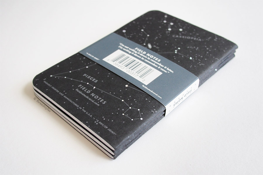
Night Sky is the summer release of Field Notes from 2013, 19th in their quarterly edition series (called COLORS back then). To say it’s an absolute favorite of mine would be an understatement. It’s an all-black edition of 3 different memo books that have summer constellations printed all over the back in holographic foil. What’s not to like? Apparently, everyone agreed: upon its release in mid-June 2013, Night Sky sold out in a week at Field Notes’ website, becoming one of the fastest selling editions at the time. It even sold out before the previous season’s Colors edition, America the Beautiful, had a chance to sell out. (Both had the same edition size of 15,000 packs). Unfortunately, I was not subscribed to COLORS when Night Sky was released, and was in a rare (and regrettable) period of “buy just one pack and get more later if I like it” state of mind. I remember having to resort to other online shops later, not without difficulty.

threestaples-fnc-ns-02.jpg

Why Night Sky is no. 1 in my book ✶✧⋆

I love Night Sky and rank it #1 in my FN ranking because it’s a black, understated variation on the classic kraft Field Notes, with just enough “oomph” in the form of holographic stars, one of my favorite visual motifs. The seasonal theme, spread out among three different books each representing early, mid-, and late summer sky in the northern hemisphere, is tastefully done without overwhelming the original design (constellations and asterisms are on the exterior back cover only). I’m a big fan of matte French Paper covers, too, and the versatility and practicality of the color black can’t be beat.

Another reason Night Sky is a winner in my book: I may not like summer as a season but absolutely love summer nights. I won’t wax poetic too much about it, but I simply love how the air of summer nights can feel calming and electric at the same time. And I have once experienced a night of phenomenal stargazing, in middle of nowhere (read middle of cornfields in central Illinois) that I think of whenever I look at Night Sky. I’m sure it doesn’t hold a candle to the view at Great Basin National Park in Nevada, where the Field Notes crew shot the Night Sky film, but I still get shivers remembering my own experience. I remember feeling incredibly small, and feeling like the vastness of whatever was up there was going to swallow me up in a blanket of stars. How everything felt like nothing, and vice versa...

threestaples-fnc-ns-06.jpg

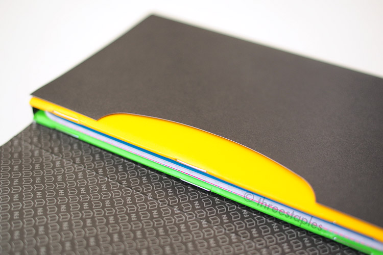
I said I wouldn’t wax poetic, didn’t I? Oops. The point is, I love the theme of Night Sky and all the aforementioned details that support it, plus other subtle details like black staples, reticle-graph grid, and the grey ink on black matte paper. I’ll get into these specs in more detail in the next section, but I’ll briefly talk about its body paper here. As with many other older editions, Night Sky has the 50#T version of Finch Paper Opaque Smooth in Bright White, while these days you’re more likely to see the thicker 60#T or 70#T. It does feel decidedly thinner in my hand compared to the newer editions. I don’t hold this against Night Sky. In fact, I actually enjoy how slim and “pocketable” the older editions feel, and how when the spine is broken in, the cover closes on its own. And the paper in Night Sky performs well and feels smooth with my usual gel pens.

threestaples-fnc-ns-12.jpg

Firsts

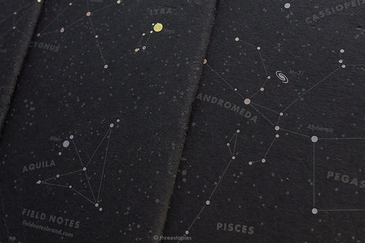
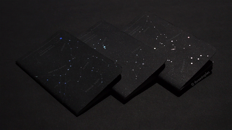
What sets Night Sky apart from any other quarterly edition of Field Notes is that it features holographic foil. It’s not the first to get foil-stamped; Balsam Fir and Day Game were the firsts (Winter 2010 and Summer 2012 respectively). But it is the first, and the only one so far, to be hot-stamped with silver holographic foil. I love how the stars flash and shine in a rainbow of colors depending on the angle I hold the books. Fun fact: Field Notes originally wanted to print the stars in a glow-in-the-dark ink but it wasn’t “glowy” enough. Thankfully, they instead found a satisfactory alternative in the holographic foil, and I’m so glad they didn’t give up on the idea. I suspect the foil will last longer than glow-in-the-dark ink anyway. Not that I wouldn’t want to see Field Notes successfully incorporate glow-in-the-dark in a future release. But at this point, I’m not holding my breath.

threestaples-fnc-ns-07
threestaples-fnc-ns-08.jpg

Another major “first” in Night Sky: black staples. It was a no brainer for a black edition, but I appreciate that they went the extra step and made sure that the only things shining on the cover would be the stars. By the way, Night Sky was not the first edition to deviate from the standard silver staples. America the Beautiful from Spring 2013, just before Night Sky, was the first ever Colors edition to do so, with copper-colored staples.

Innards comparison, from left: graph grid in original kraft, dot grid in Pitch Black (1st version), and reticle grid in Night Sky.

Innards comparison, from left: graph grid in original kraft, dot grid in Pitch Black (1st version), and reticle grid in Night Sky.

Night Sky was also the first to get a reticle-graph grid, a sort of a hybrid between dot grid and graph grid, with tiny cross-hairs like the ones found in optical instruments. A very fitting detail that makes Night Sky even more special. I like both dot grid and graph grid, and this reticle-graph has worked nicely for me so far. Not too distracting as long as I use a dark pen or pencil. There have been only two other quarterly editions that feature the reticle-graph grid since: Unexposed from 2014 and Lunacy from 2016, both fall editions.

threestaples-fnc-ns-10.jpg
threestaples-fnc-ns-11.jpg

One last “first”: Night Sky was the first Colors edition to forego the “Practical Applications” section usually found on the back inside cover. I think it was a sensible design move, obviously to make room for paragraphs of corresponding information on what kind of constellations and asterisms to look out for at different times of the summer (at roughly midnight), like Ursa Major, “The Summer Triangle”, and Cassiopeia. But I like that they didn’t try to cram that on the back cover or the front inside cover. Other quarterly editions that skipped “Practical Applications”: Arts & Sciences, Two Rivers, and Byline. Coincidentally, A&S and Byline are both summer editions, just like Nighty Sky.

Not pictured is the front inside cover, which I’m glad they kept it all black and consistent with the rest of the cover. It makes recording pertinent information a bit tricky but nothing a white or metallic ink can't handle. *gives Lunacy the side-e…

Not pictured is the front inside cover, which I’m glad they kept it all black and consistent with the rest of the cover. It makes recording pertinent information a bit tricky but nothing a white or metallic ink can't handle. *gives Lunacy the side-eye*

Additional Notes

By now, I think it’s safe to generalize that black Field Notes are very popular. It’s been said on a few occasions that Raven’s Wing and Night Sky were some of the fastest selling Field Notes, and I wouldn’t be surprised if Lunacy (Fall 2016) is also up there. So it was not surprising that Field Notes followed up Night Sky with Pitch Black in November 2013 for their product line-up as a non-limited offering. Pitch Black has gone into a second iteration and looks different now, but the original version was a very close cousin of Night Sky, just like Red Blooded was an off-shoot of Fire Spotter in 2011. Same materials and colors but with dot grid, a new set of “Practical Applications”, and without the holographic stars on the back. Identical to Night Sky when viewed from the front, closed. The new version of Pitch Black looks great but I admit I was a bit sad to see the 1st version of Pitch Black go, because I knew it was as close as one could get to Night Sky.

I already mentioned the film Field Notes made for Night Sky, but I would be remiss if I didn’t direct you to read up on how they filmed it at The Mather Overlook in The Great Basin National Park in Nevada. I haven’t watched the whole thing, nor do I have the right equipment to fully appreciate it, but there’s also a 6+ hour version up on YouTube, where you can watch the stars slowly moving across the sky in real time. (The HD version is up on Vimeo).  Apparently, it was one of the very first 4k videos uploaded to YouTube. It must have been an unforgettable experience filming and seeing the stars at such a location, because Bryan Bedell (of Field Notes, who made the film along with Steve Delahoyde) often mentions it when asked which edition is his favorite (source links below). I love the lengths that Field Notes go to to create videos like this that don’t even show the actual product they’re promoting.

Jim Coudal, co-founder of Field Notes, also often says Night Sky is one of his favorites. Below are some video and podcast links where the FN crew talk about Night Sky, and how they originally wanted to do glow-in-the-dark for it, etc, etc.:

  • An Obsessive’s Guide to Field Notes COLORS: Part Five (2013) on Vimeo
  • CMD Space #57: Digital and Physical things, with Jim Coudal - Relay FM (August 16th, 2013): about 1 hour and 4 minutes in.
  • The Pen Addict #69: Give ‘em Hell Bryan Bedell! - Relay FM (August 27th, 2013): about 18 minutes in.
threestaples-fnc-ns-03.jpg
threestaples-fnc-ns-13.jpg

Overall, Night Sky is a great-looking and versatile edition that never fails to remind me why I love Field Notes. At this point, I don’t know if or how any edition will ever top it. If one ever does, then I’ll be very pleasantly surprised and I look forward to that day.

Black staples (from left): Utility, Sweet Tooth, Capsule (AW 2014), Lunacy, Pitch Black (1st version), and Night Sky.

Black staples (from left): Utility, Sweet Tooth, Capsule (AW 2014), Lunacy, Pitch Black (1st version), and Night Sky.

Reticle grid comparison (from left): Night Sky, Unexposed, Starbucks Reserve “Capitol Hill”, and Lunacy.

Reticle grid comparison (from left): Night Sky, Unexposed, Starbucks Reserve “Capitol Hill”, and Lunacy.

Quick black color comparison! Top row (from left): Pitch Black (1st version), Night Sky, Night Sky (back view), Just Below Zero, and Arts & Sciences. Bottom row (from left): TEDx Portland, Raven’s Wing, Lunacy, DDC “Pretty Much Everything”, and …

Quick black color comparison! Top row (from left): Pitch Black (1st version), Night Sky, Night Sky (back view), Just Below Zero, and Arts & Sciences. Bottom row (from left): TEDx Portland, Raven’s Wing, Lunacy, DDC “Pretty Much Everything”, and Drink Local “Stout”. For more “gray” color comparison, please see the Just Below Zero post.

Some Fun (for me) Details

  • Night Sky is the 2013 Summer edition of COLORS, the 19th in the series.
  • Item number: FNC-19
  • Price: $9.95/pack of 3 books
  • Edition size: 15,000 packs (or 45,000 books)
  • Printed: June 2013
  • The old website said 700 subscriptions were available starting with Night Sky; the email announcement at the time said 500.
  • Printed by: Service Graphics, Inc., Oakbrook Terrace, Ill.
  • Cover paper: French Paper Construction “Blacktop” in 100#C, printed with “Stealth Gray” soy-based Toyo ink and holographic hot-stamped foil.
  • Inside covers: printed with the same “Stealth Gray” ink
  • Body paper: Finch Paper Opaque Smooth 50#T in “Bright White”
  • Reticle-graph grid inside (3/16"x 3/16"): unspecified light gray soy-based Toyo ink
  • Edition-specific extras: none
  • Belly band: white paper printed with dark gray ink
  • Staples color: black
  • Film: An Obsessive’s Guide to Field Notes COLORS: Part Five (2013) on Vimeo
  • Film: Field Notes: Night Sky Edition on Vimeo
  • Film: The Stars and Their Courses on Vimeo (3+ hours)
  • Film: Field Notes: The Stars and Their Courses - YouTube (6+ hours)
  • How they shot the video: “Walk Out on the Milky Way.” | Field Notes
Don’t blink.

Don’t blink.

My Favorite “Practical Applications”

There were no “Practical Applications” printed on the back cover of Nighty Sky, but there were some suggested by Field Notes in their email announcement, including:

  • Homemade Firework Construction Plans
  • Which Orchard Walls Are High and Hard to Climb
  • Favorite Quotes from Dandelion Wine (one of my favorite books)
threestaples-fnc-ns-05.jpg
threestaples-fnc-ns-black-07.gif

Thanks for reading until the end! What are your thoughts on Night Sky?

In Field Notes Colors Tags field notes, field notes night sky, night sky, black, summer edition, reticle grid, foil-stamped, holographic foil, french paper, french paper construction, black staples
10 Comments

Field Notes Colors: Unexposed

October 2, 2014

The 2014 fall edition of Field Notes COLORS is called Unexposed, and here they are EXPOSED! Should I be providing a spoiler alert here? …Nah.

When Unexposed was first announced in early September, all we saw was a single image of a 3-pack wrapped in black. Mysterious! Turns out, that was the intention, to keep the content veiled until you open it yourself. The only information that was provided was that there were 6 different memo books available and that each 3-pack would have 3 random, different books among those 6. That would be a total of 20 different combinations. The suspense was exciting for me, and I tried to not browse any tags on Twitter and Instagram, until my own subscription mail arrived. I was glad that lucky folks who got their copies first were considerate enough and only posted pictures of their unopened packs. I was pretty successful in avoiding any spoilers, until I saw this tweet. Why did you retweet it so early, Field Notes, why?

Obviously, I didn’t try hard enough.

Black sleeve instead of a belly band

With sleeve open

Great contrast between opaque black and vibrant colors

Great contrast between opaque black and vibrant colors

Silver staples.

Silver staples.

Oh well, I still got a kick out of opening my own two 3-packs when they arrived because of their sheer shocking colors. I don’t think pictures can really capture how conspicuous they are. My initial reaction:

  • My eyes, my eyes! They hurt!
  • Thank goodness, they’re back to the original size. 
  • Darn, I’m missing one color. But not bad! 5 out of 6 colors!
  • Whoa, they did pink! I thought I’d never see it in COLORS.
  • Uh, there’s a registered trademark symbol on the covers now. 
  • I want to cut out belly bands out of the black sleeves. Just because.
  • Staples are better positioned in this edition. 
Colors for background and text are reversed inside each book. Blue book has blue text on pink background. Do not attempt to read the text.

Colors for background and text are reversed inside each book. Blue book has blue text on pink background. Do not attempt to read the text.

My eyes find these front three to be the worst offenders, the leftmost one (green book with orange inside) being the most painful, then the orange book (blue inside) and then the blue book (pink inside). Again, do not attempt to read these. Just don…

My eyes find these front three to be the worst offenders, the leftmost one (green book with orange inside) being the most painful, then the orange book (blue inside) and then the blue book (pink inside). Again, do not attempt to read these. Just don’t.

Backs!

From top: inside of pink, yellow, purple, green, orange and blue books.

Soft-touch coating is slightly less “rubbery” than Drink Local, in my opinion.

Soft-touch coating is slightly less “rubbery” than Drink Local, in my opinion.

Firsts

Unexposed is not the first edition to feature 6 different colors. National Crop (Spring 2012) and Drink Local (Fall 2013) are very notable earlier examples. Drink Local also beats Unexposed in getting the soft-touch coating. And Unexposed is not the first to feature reticle graph grid; we saw it previously on Night Sky (summer 2013). Additionally, this is the second time COLORS is printed by eDOC Communications, after Arts & Sciences (Summer 2014).

What’s interesting about Unexposed is that this is the first time in COLORS history where the colors were kept secret AND each pack is a random set of colors. I don’t know how I feel about that. It took me 3 packs to get all 6 colors. If I were to look at it glass half empty, the uniqueness of the edition was focused a bit much on the marketing aspect. The word gimmicky comes to mind. BUT! If I were to look at it glass half full, this edition is awesome because you get 6 new colors in one release. To quote the “Anonymous” Field Notes Enthusiast: Holy ████ !!

Best part of the Unexposed promo video: “Anonymous” Field Notes Enthusiast. :D (image captured from this video)

Best part of the Unexposed promo video: “Anonymous” Field Notes Enthusiast. :D (image captured from this video)

The anticipation before the reveal, the shock of the colors and the random factor... it was all exciting but the novelty of it doesn’t last very long, unless you really love neon colors.  I like them *shrug* (see how it ranks in my book). But I also don’t like soft-touch covers very much. I’m hoping the coating doesn’t turn into weird colors like it did in Drink Local. And I’m not going to get into the whole collectibility of this edition. There are many kinds of collectors, and thinking makes my head hurt, which it already is from these neon colors.

Moving on. Other noteworthy “firsts” in the COLORS series: the black paper sleeve, the ® mark, and the inks. Did you see the pattern inside the black sleeve? Isn’t that sick? I want it as a wallpaper. Like, real wallpaper around my humble Field Notes shrine. And the ® mark on the cover? It is hard to miss. Quick search at US Patent and Trademark Office (not linking it. I’ve had to deal with this site a few times before. One of the worst sites EVER) leads me to believe that they finally got it registered this year, and I understand why it’s added. Visually, it’s going to take some time for me to get used to. You can spot it on the inside and outside cover on the back, too. So tiny! Don’t strain your eyes!

This is the first time in COLORS that we’re seeing Sappi McCoy paper for the covers and Saphira inks, which are used on both the covers and the innards. You might call me a party pooper or a cynic but I do appreciate Field Notes trying new things. Like new printers, new papers, new inks. New fluorescent inks. How the heck do you even make these.

No doubt Unexposed is a fun and special edition, not to be missed by any Field Notes fan. The original size format is back and with the soft-touch coating, it's even more portable. It might even be an awesome conversation starter. But if my house was burning down and I had a split second to grab a pack of FN, Unexposed would not be my first choice. Except, maybe it might be the only one I can spot?

Hey, what’s that ® thing doing there?

Hey, what’s that ® thing doing there?

Reticle graph comparison: Unexposed (top) is slightly lighter gray than Night Sky (bottom).

Reticle graph comparison: Unexposed (top) is slightly lighter gray than Night Sky (bottom).

Some fun (for me) details:

  • Unexposed (Fall 2014) is the 24th in the COLORS series.
  • Item Number: FNC-24
  • Edition size: 60,000 books printed in August 2014. Does that mean 10,000 per color?
  • Cover: Sappi McCoy 100#C in Silk White with soft touch-coating, printed in six different fluorescent, soy-based Saphira inks. Each book is printed in two colors (reversed on inside covers):
    • blue book with pink text
    • pink book with yellow text
    • yellow book with purple text (see the pattern so far?)
    • purple book with green text
    • green book with orange text
    • orange book with blue text
  • Paper inside: Finch Paper Opaque Smooth 50#T in “Bright White”, the usual
  • Reticle grid inside: Pantone Cool Gray 2 soy-based Saphira ink
  • Belly band: none. Black paper sleeve instead.
  • Staples color: silver
  • Film: Field Notes COLORS Fall 2014 Edition (bleep!)

My Favorite “Practical Applications”:

  • #03. Neon Sign Sketches
  • #11. Hungrybear9562 Quotes
  • #26. Favorite Phosphorescents
  • #27. Minds Blown

Which out of 6 colors is your favorite? It’s a toss-up between the pink and the purple one for me.

Quick green comparison. From left: Balsam Fir, Day Game, Grass Stain Green, Soybeans from National Crop, neon green from Summer Camp. Unexposed’s green is more neon than Summer Camp’s green!

Quick green comparison. From left: Balsam Fir, Day Game, Grass Stain Green, Soybeans from National Crop, neon green from Summer Camp. Unexposed’s green is more neon than Summer Camp’s green!

In Field Notes Colors Tags field notes, unexposed, colors, blue, purple, green, orange, pink, yellow, black, fall edition, reticle grid, eDOC Communications, sappi mccoy, silver staples, no belly band, neon, fluorescent, soft-touch coating
Comment
Older Posts →

WELCOME

I’m Jinnie!

✿(。◕‿◕。)☆彡

Twitter: @threestaples

Instagram: @threestaples

Subscribe: RSS


COPYRIGHT

© 2014–2020 Three Staples. All Rights Reserved. Please DO NOT use any part of this site, especially pictures, without permission. I’m being serious. Please see ABOUT page for details. 


Field Notes by Theme

Field Notes Item Numbers


LEGIT “PRESS”

February 2015 was HUGE for me, you guys. I got some shout outs directly from Jim Coudal and Field Notes.

And another one!

Thanks for that. :)


LATEST ENTRIES

Featured
threestaples-FN-IGpolls-Wilco2019-00.jpg
Nov 15, 2019
Field Notes: Instagram Polls (Part 6 - Wilco)
Nov 15, 2019
Nov 15, 2019
threestaples-fn-ccomp-ggray-P9044884-main.jpg
Nov 4, 2019
“Grout Gray” Field Notes
Nov 4, 2019
Nov 4, 2019
threestaples-PA165046-hangers1.jpg
Oct 18, 2019
Field Notes DIY: Non-slip hangers with Bands of Rubber
Oct 18, 2019
Oct 18, 2019
threestaples-FN-IGpolls-NationalParks2019-00.jpg
Oct 15, 2019
Field Notes: Instagram Polls (Part 5 - National Parks)
Oct 15, 2019
Oct 15, 2019
threestaples-FN-IGpolls-Summer2019-00.jpg
Oct 11, 2019
Field Notes: Instagram Polls (Part 4 - Summer Editions)
Oct 11, 2019
Oct 11, 2019
threestaples-FN-IGpolls3-00.jpg
May 21, 2019
Field Notes: Instagram Polls (Part 3 - Mile Marker)
May 21, 2019
May 21, 2019
threestaples-FN-IGpolls2-00.jpg
Mar 26, 2019
Field Notes: Instagram Polls (Part 2 - Spring Editions)
Mar 26, 2019
Mar 26, 2019

Archive
  • November 2019
  • October 2019
  • May 2019
  • March 2019
  • July 2018
  • June 2018
  • May 2018
  • April 2018
  • March 2018
  • February 2018
  • January 2018
  • December 2017
  • November 2017
  • October 2017
  • September 2017
  • August 2017
  • July 2017
  • June 2017
  • May 2017
  • April 2017
  • March 2017
  • December 2016
  • November 2016
  • October 2016
  • September 2016
  • August 2016
  • July 2016
  • June 2016
  • May 2016
  • April 2016
  • March 2016
  • February 2016
  • January 2016
  • December 2015
  • November 2015
  • October 2015
  • September 2015
  • August 2015
  • July 2015
  • June 2015
  • May 2015
  • April 2015
  • March 2015
  • February 2015
  • January 2015
  • December 2014
  • October 2014
  • September 2014
  • August 2014
  • July 2014
  • June 2014
  • May 2014
  • April 2014
  • March 2014

MY WISHLIST

  • Gimme all of these. Stat.


Some Amazon.com links on this site may be affiliate links, which means: if you follow these links and make a purchase, I will receive a small commission. You will not pay more by clicking through these links. Every little bit will help fund the hosting of Three Staples, so your support would be greatly appreciated. Thanks!


Copyright © 2014–2020 Three Staples. All Rights Reserved. Please do not use any part of this site without permission.