After white and yellow, I’m choosing pink for my next installment of Field Notes color comparisons. Maybe it’s because Valentine’s Day is coming up. Who knows? 😁
Pink is a very uncommon color in Field Notes. Even when you do find a pink Field Notes, it’s more likely to be just one of the colors in an edition. So, can you identify the three editions pictured above?
COLORS Editions
As of this writing (early February 2016), there has been only one COLORS edition where you can find a solid pink Field Notes memo book, and that is Unexposed (Fall 2014). Pink was one of the six possible colors in Unexposed, and it’s a very bold, neon color. There’s a semblance of pink in some of the Two Rivers (Spring 2015) prints and in the Workshop Companion (Summer 2015) “Painting” book, but the base colors in those were not pink, and for my comparison here, I’m sticking to solid covers.
Non-COLORS Editions
Even outside of COLORS, pink Field Notes are still hard to find. In my collection, there are only two editions that I can describe as “pink”:
- Capsule Show SS14 (from 2013)
- XOXO Festival 2013
Other “pink” Field Notes that I know of:
- Point Oh! Edition (3-pack with 3 different colors): one of them is a pastel pink book (French Pop-Tone “Pink Lemonade”, the same as Capsule SS14’s cover)
- Starbucks Roastery “Capitol Hill” Edition (5-pack with 5 different colors): one of them is a magenta book.
These two won’t be discussed in this post because I don’t have them. If you know of other pink editions, do chime in!

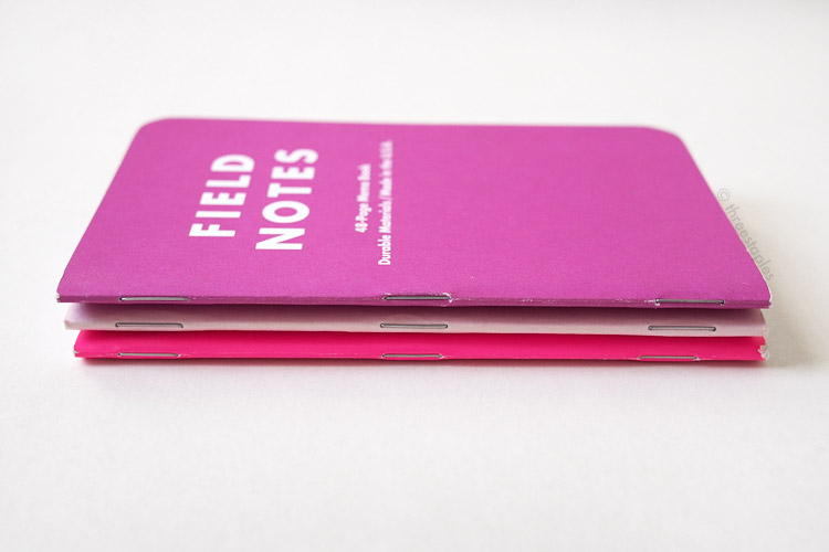
From left: XOXO 2013, Unexposed, and Capsule SS14. In reality, Capsule doesn't look as light as pictured. It just looks very light against the other two.
Comparison
So, I have a total of three “pink” Field Notes that I will compare in this post.
- Unexposed
- Capsule SS14
- XOXO 2013
While Unexposed’s pink is a very bold, bright medium pink, Capsule SS14 is a light, pastel pink. As for the XOXO 2013 edition, it’s more likely to be called magenta or fuchsia. But I think it can also be described as a deep pink, and since there aren’t that many in my collection that lean towards the “pink” family, I’m including it here. When seen next to Unexposed, the XOXO definitely looks much cooler, almost like purple.

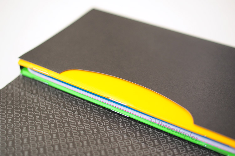
Both Capsule and Unexposed’s covers are 100#C, while XOXO’s cover feels the thinnest (80#C). Capsule, which uses French Paper Pop-Tone in Pink Lemonade, feels the thickest and the stiffest. Unexposed’s cover paper (Sappi McCoy) actually feels more pliable and durable, due to its soft-coating. And because of this coating, Unexposed is the only one among this group to have a semi-glossy finish. Unexposed is also different from the other two in that its inside cover is not pink but yellow (matching the text color on its front cover). Capsule’s Pop-Tone cover is special in that it’s pink all the way through the paper (as seen in the side-view photo below), not white stock printed with pink on the outside like in the other two editions.

From top: Capsule SS14, Unexposed, XOXO 2013.

Innards are all different! From top: dot grid in Capsule SS14, graph grid in XOXO 2013, and reticle grid in Unexposed.
What’s really neat about the non-COLORS pink editions is that both of their body papers are printed in light pink. XOXO is graph grid in Pantone 236 light pink, and Capsule is dot grid in Pantone 7422. Unexposed is reticle grid in Pantone Cool Gray 2. Another noteworthy point: the 3-packs that XOXO and Capsule came in were not assortments of colors. They were all pink, unlike Unexposed.
Last comparison note: all three editions are bound by silver staples! ٩(ᴖᴗᴖ*)۶


Capsule SS14 is the only one with extra graphics on the back cover: “Vive la différence”. It’s printed in metallic ink but the shimmer is very subtle.
My favorite among these pink Field Notes is the Capsule SS14 edition. I like how the thick, matte French cover in soft pink, the pink dot grid, and the warm metallic ink all come together. It's a very sophisticated looking edition, and it feels quite substantial in your hands.

Am I a big fan of the color pink? Not really but I enjoy it occasionally. I think the colors like Unexposed’s pink and the XOXO 2013 can be a lot of fun, and a COLORS edition entirely dedicated to pink would a nice change of pace. And there are so many delicious shades of pink to work with! Field Notes, may I suggest French Pop-Tone in “Razzle Berry” or “Cotton Candy”? Judging from the Field Notes 2014 recap video, maybe there'll be enough “dudes” who would like it too?
Do YOU want to see more pink Field Notes?