Here’s another idea that inspired me to start this blog: Field Notes color comparisons! I’ve been sneaking some quick color comparisons in previous Field Notes posts but I think it’s high time that I do a dedicated post on a color. And I choose “white” first!
Can you think of all the Field Notes that have white covers?
COLORS Editions
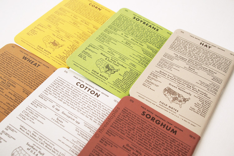
Out of the Colors series, there have been three so far (as of January 2015): Northerly (Winter 2011), National Crop “Cotton” (Spring 2012), and Day Game “Hardball White” (Summer 2012). That’s three editions in a row!
I’ll just let the pictures do most of the talking.
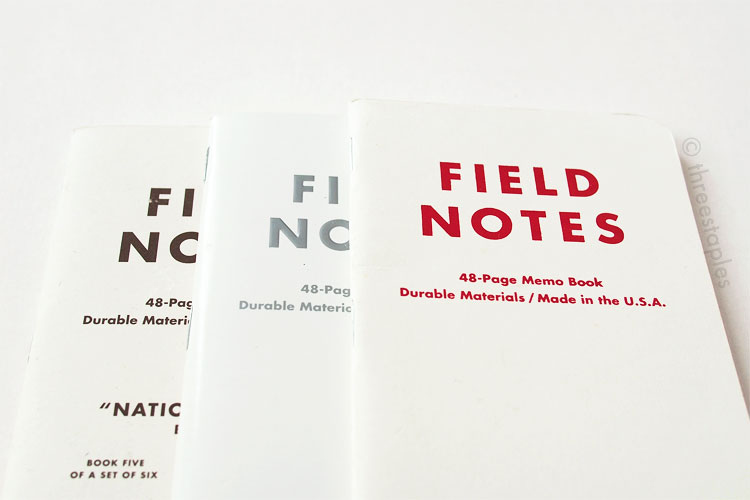
From left: National Crop’s “Cotton”, Northerly, and Day Game’s “Hardball White”.

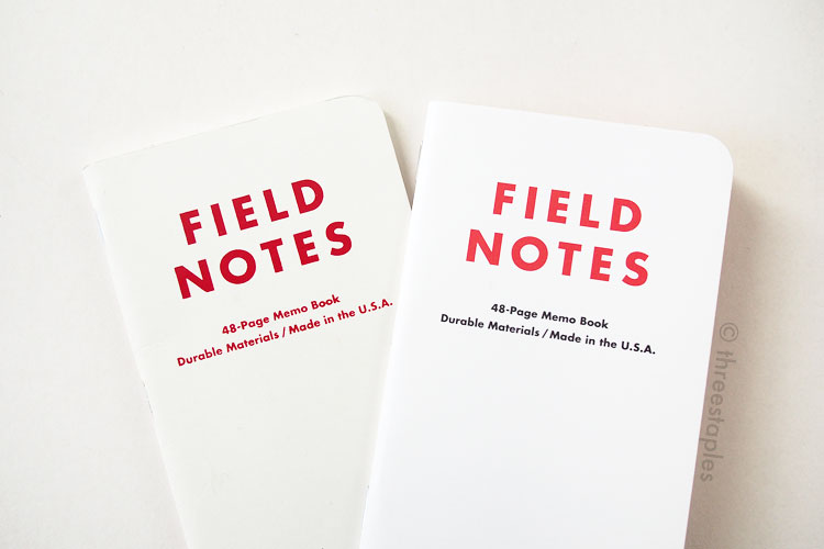
Back views, from left: Northerly, National Crop’s “Cotton”, and Day Game’s “Hardball White”.
Northerly easily stands out as the most different one here with its glossy cover, embossed logotype, metallic ink, colored body paper, and inverted graph grid. But Day Game is unique in that its cover is foil-stamped with red, features dot grid inside, and has a small home plate on the back. National Crop's “Cotton” is simply offset printed but its cover paper has a slightly speckled look (French Paper Speckletone) and includes extra text and graphics on the front and back. Well, looks like each one is pretty unique, doesn’t it?

From top: Day Game “Hardball White”, National Crop “Cotton”, and Northerly.
The inside cover on each of these editions is the same color as the outside cover. They all have silver-colored staples.
I could compare these until cows come home, down to ink colors, but I’m limiting myself to mainly the look and feel of the covers.
Northerly looks the “coolest” white among the three. “Cotton” looks slightly warmer than “Hardball White” with a red tinge to it, but that’s how I interpret colors. Describing colors can be quite personal, I think!
Non-COLORS Editions
Now, let’s compare them with a couple non-Colors Field Notes with white covers that I have: Capsule Autumn/Winter 2014 edition and TEDx Portland edition (official name on the back inside cover is “TEDx ✕ Ernest & Young”).


Inside covers, from right: Northerly, Day Game, National Crop, Capsule AW14, TEDx Portland.
The TEDx edition is a 3-pack, comprised of three colors: black, red, and white. Obviously, I’m comparing only the white book here. Key points to note about TEDx and Capsule editions:
- The white covers on both have matte finish, making Northerly still the only glossy, white edition so far (that I know of).
- Both are offset printed and have extra text and graphics on the back, like National Crop’s “Cotton”. “Cotton” is the only book with extra graphics on the front.
- Both are printed with darker colors on the inside covers. Red in TEDx and copper in Capsule.The white in TEDx looks brighter but that might not be accurate because of these interior colors.
- Both are as “cool” white as Northerly. Day Game is the most “yellow” white among these five editions.
- TEDx’s outside cover is printed in two colors, not one as in the others.
- Capsule AW14 has black staples.
As for the thickness, they all feel quite similar, except Day Game and Capsule don’t feel as stiff as the others. And TEDx’s cover feels the smoothest, besides Northerly. Of course, I’m no expert on paper, and these descriptions are just based on my own unscientific “testing”. Quotation marks galore!

Innards, from left: Northerly, Day Game, National Crop, Capsule AW14, TEDx Portland.

All have silver staples, except for Capsule AW14 edition (black staples).
At first glance, Northerly seems the most unique one, and it may very well be, depending on how you look at it. I personally feel that paired with slightly different details and colors, each white edition so far managed to have a very different personality. That’s one of the reasons why I love Field Notes. Give me another white edition and I bet it’d be just as fresh.
Here are the specific names of the white covers. Look who’s learning to make tables with HTML and CSS!
| Edition | Cover Paper |
|---|---|
| Northerly | Smart Kromekote 14pt C25 “White” |
| National Crop “Cotton” | French Speckletone “Starch White” (My guess is 100#C) |
| Day Game “Hardball White” | French Construction “Recycled White” 100#C |
| Capsule AW14 | French Pop-Tone “Sweet Tooth” 100#C |
| TEDx ✕ Ernest & Young | Accent Opaque “Way White” 100#C |
Other white Field Notes that would be fun to compare but are not in my possession:
- J. Crew
- Levi’s “Notes Along the Road” (French Construction #100C)
- Capsule AW 2015
I wouldn’t be surprised if there are more! If you know of others, please let me know!

From left: Northerly, Day Game, National Crop, Capsule AW14, TEDx Portland.

Red in TEDx is lighter and more orange than the red in Day Game’s “Hardball White”.

French Paper samples, clockwise from top: Pop-Tone in Sweet Tooth (Capsule AW14), Speckletone in Starch White (National Crop’s “Cotton”), and Construction in Recycled White (Day Game’s “Hardball White”).


Just to show how white these are, compared to, say, the Doxie edition.
Which white Field Notes is your favorite? What should I do when I get another white Field Notes? Re-do this whole post? Ack!! That will be the challenge of these color comparison posts.
Which color should I do next? :)