• Home
  • About
  • Journal
  • Archive
  • My Field Notes
  • Links
Menu

Three Staples

a stationery site by jinnie
  • Home
  • About
  • Journal
  • Archive
  • My Field Notes
  • Links
threestaples-fn-ccomp-yellow-01.jpg

Field Notes Color Comparison: Yellow

April 30, 2015

Yellow is not an uncommon color for Field Notes memo books. Almost every year, there’s been a yellow Field Notes from the COLORS series, starting with Packet of Sunshine in 2010. Can you name all the yellow Field Notes so far?

COLORS Editions

Here they are:

  • Packet of Sunshine (Spring 2010)
  • County Fair (Summer 2010)
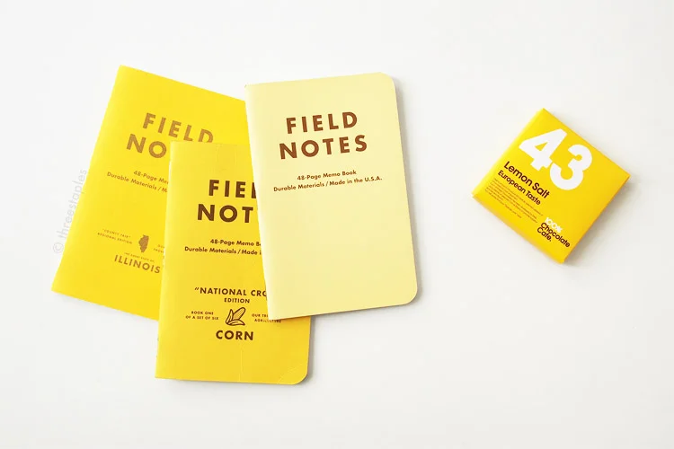
  • National Crop “Corn” (Spring 2012)
  • Drink Local “Pale Lager“, “Pilsner”, and “India Pale Ale” (Fall 2013)
  • Unexposed (Fall 2014)
  • Two Rivers (Spring 2015)

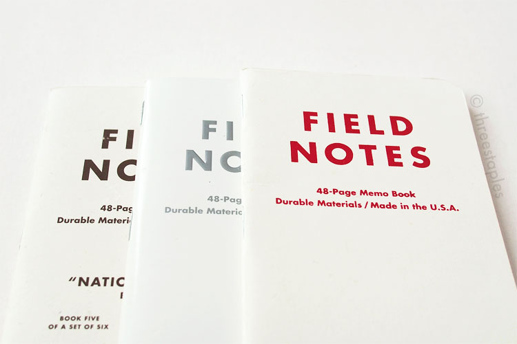
This is a longer list than white, isn’t it? 

I realize “India Pale Ale” from Drink Local (far left, pictured above) is borderline yellow, being very close to light brown, tan, or even orange but I thought it was close enough to “yellow” that it’d be fun to include. Two Rivers is also included because of its base color, even though it is the only one that’s not completely solid yellow. Again, I thought it shared enough similaries with other yellow books that it deserves to be included. I think that some of these can easily belong in other color groups, so don’t be surprised to see them again in future comparison posts!

threestaples-fn-ccomp-yellow-02.jpg

Texture-wise, I can divide the yellow books into two groups: matte and soft-touch coated. Drink Local and Unexposed covers belong in the latter group, and the rest make up the matte group. County Fair is the only one with the linen texture, with Neenah Sundance Linen as its cover. The other three matte covers, Packet of Sunshine, National Crop’s “Corn,” and Two Rivers, all use French Paper Pop-Tone in “Lemon Drop” in 100#C. I find these Pop-Tone covers pretty special because they’re not simply white stock printed with yellow ink, like in other yellow covers. If you look at at them from the side, you can see that the paper is yellow all the way through.

The three books on the far right are all French Paper Pop-Tone in “Lemon Drop.”

The three books on the far right are all French Paper Pop-Tone in “Lemon Drop.”

Color-wise, I would pick County Fair’s yellow as having the most rich, matte, yellow color, closely followed by the three that use French Pop-Tone. Drink Local’s “Pilsner” is on the dull side for me, and “Pale Lager” looks the lightest. I think of “banana cream” when I look at it. :) The Unexposed’s yellow? That’s like a slap-in-your-face, bright, fluorescent yellow, and I like it the least among the COLORS yellows.

I swear, I happened to be eating that chocolate while taking pictures.

I swear, I happened to be eating that chocolate while taking pictures.

Yellow covers with extra text and graphics on the back. County Fair is the only one printed in gold but it doesn’t look particularly metallic.

Yellow covers with extra text and graphics on the back. County Fair is the only one printed in gold but it doesn’t look particularly metallic.

Other note-worthy differences:

  • Drink Local, National Crop, and County Fair all have “extra” graphics and text, on top of the usual logotype and texts. 
  • All have silver-colored staples, except for Drink Local (gold) and Two Rivers (copper).
  • Soft-touch coated covers have darker inside covers: dark purple in Unexposed’s yellow and dark brown in Drink Locals.
  • Unexposed is the only edition with reticle grid. The rest are regular graph grid.
  • The body paper in all yellow editions have the same weight but Packet of Sunshine is the only one with Boise Offset Smooth 50#T in “White.” The rest use Finch Paper Opaque Smooth 50#T in “Bright White.” (Older editions tend to use the Boise paper). 
  • The most “yellow” graph grids are found in Packet of Sunshine and Drink Local; the rest are either gray or light brown.
threestaples-fn-ccomp-yellow-11.jpg
Neon Ice Pop (top) and Summer Camp (bottom).

Neon Ice Pop (top) and Summer Camp (bottom).

Non-COLORS Editions

The only other yellow Field Notes in my possession are:

  • Neon Ice Pop (First printing, January 2010)
  • Summer Camp (First printing, May 2011)

They are both from neon, summer-themed editions! I would categorize these as pretty straightforward: outside and inside covers are the same color with no extra graphics or texts, silver staples, and white 50#T innards with graph grid. They both fit in the matte group but their covers are noticeably thinner (French Smart White 80#C printed with yellow inks). And their neon color gives them a much cooler feel, almost light green compared to the rest of the yellow covers. Certainly very different from the “flourescent” yellow from Unexposed, which is warmer and just screams yellow. What I find special about these neon editions is that the body paper is gridded in light blue called “Summer Sky Blue.” Summer Camp is actually one of my favorites, and if it were a COLORS edition, it would place very high in my Field Notes ranking. I might even do a separate post on the subtle differences between Neon Ice Pop and Summer Camp in the future.

From left: Summer Camp, Neon Ice Pop, and Unexposed.

From left: Summer Camp, Neon Ice Pop, and Unexposed.

The only other edition that’s yellow that I am aware of is Capsule Show’s 5th anniversary edition from 2012. I WANT IT. It’s debossed, for goodness sake. *sigh* Well, if you know of any other yellow editions, do chime in!

threestaples-fn-ccomp-yellow-12.jpg

Inside covers, not yellow in Drink Local and Unexposed.

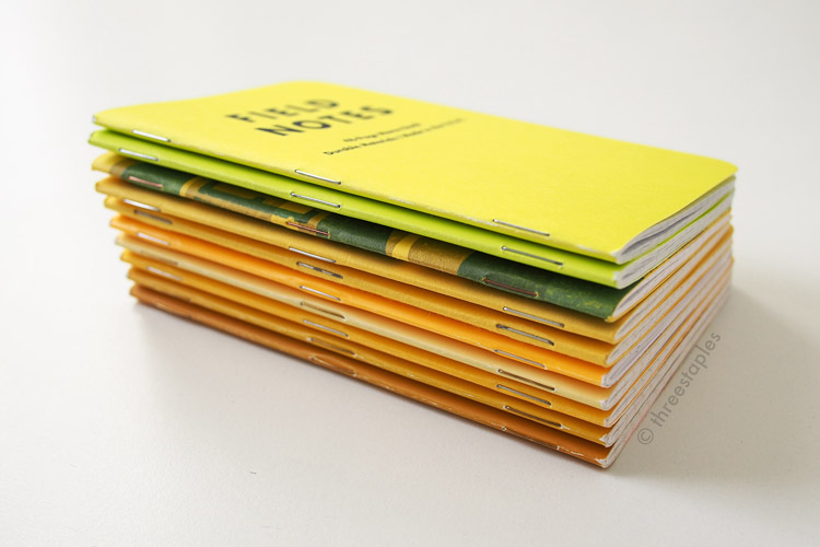
Innards, from left: Two Rivers, Unexposed, Drink Local, National Crop “Corn”, County Fair, Packet of Sunshine, Neon Ice Pop, Summer Camp.

Adding Original kraft on the far right!

Adding Original kraft on the far right!

Do you like yellow Field Notes? If so, which is your favorite? For me, it’d be a toss-up between Packet of Sunshine and County Fair. Packet of Sunshine for its sunny-ness (heh) and County Fair for its linen texture. Hm... I wonder if there’ll be any more yellow this year.

In FN Color Comparison Tags field notes, color comparison, national crop corn, silver staples, not COLORS, national crop, copper staples, gold staples, colors, french paper, french paper pop-tone, graph grid, reticle grid, sappi mccoy, new page sterling premium, soft-touch coating, french paper smart white
Comment

Field Notes Color Comparison: White

February 2, 2015

Here’s another idea that inspired me to start this blog: Field Notes color comparisons! I’ve been sneaking some quick color comparisons in previous Field Notes posts but I think it’s high time that I do a dedicated post on a color. And I choose “white” first!

Can you think of all the Field Notes that have white covers?

COLORS Editions

Out of the Colors series, there have been three so far (as of January 2015): Northerly (Winter 2011), National Crop “Cotton” (Spring 2012), and Day Game “Hardball White” (Summer 2012). That’s three editions in a row!

I’ll just let the pictures do most of the talking.

From left: National Crop’s “Cotton”, Northerly, and Day Game’s “Hardball White”.

From left: National Crop’s “Cotton”, Northerly, and Day Game’s “Hardball White”.

Back views, from left: Northerly, National Crop’s “Cotton”, and Day Game’s “Hardball White”.

Back views, from left: Northerly, National Crop’s “Cotton”, and Day Game’s “Hardball White”.

Northerly easily stands out as the most different one here with its glossy cover, embossed logotype, metallic ink, colored body paper, and inverted graph grid. But Day Game is unique in that its cover is foil-stamped with red, features dot grid inside, and has a small home plate on the back. National Crop's “Cotton” is simply offset printed but its cover paper has a slightly speckled look (French Paper Speckletone) and includes extra text and graphics on the front and back. Well, looks like each one is pretty unique, doesn’t it?

From top: Day Game “Hardball White”, National Crop “Cotton”, and Northerly.

From top: Day Game “Hardball White”, National Crop “Cotton”, and Northerly.

The inside cover on each of these editions is the same color as the outside cover. They all have silver-colored staples.

I could compare these until cows come home, down to ink colors, but I’m limiting myself to mainly the look and feel of the covers.

Northerly looks the “coolest” white among the three. “Cotton” looks slightly warmer than “Hardball White” with a red tinge to it, but that’s how I interpret colors. Describing colors can be quite personal, I think!

Non-COLORS Editions

Now, let’s compare them with a couple non-Colors Field Notes with white covers that I have: Capsule Autumn/Winter 2014 edition and TEDx Portland edition (official name on the back inside cover is “TEDx ✕ Ernest & Young”).

Inside covers, from right: Northerly, Day Game, National Crop, Capsule AW14, TEDx Portland.

Inside covers, from right: Northerly, Day Game, National Crop, Capsule AW14, TEDx Portland.

The TEDx edition  is a 3-pack, comprised of three colors: black, red, and white. Obviously, I’m comparing only the white book here. Key points to note about TEDx and Capsule editions:

  • The white covers on both have matte finish, making Northerly still the only glossy, white edition so far (that I know of).
  • Both are offset printed and have extra text and graphics on the back, like National Crop’s “Cotton”. “Cotton” is the only book with extra graphics on the front.
  • Both are printed with darker colors on the inside covers. Red in TEDx and copper in Capsule.The white in TEDx looks brighter but that might not be accurate because of these interior colors.
  • Both are as “cool” white as Northerly. Day Game is the most “yellow” white among these five editions.
  • TEDx’s outside cover is printed in two colors, not one as in the others.
  • Capsule AW14 has black staples.

As for the thickness, they all feel quite similar, except Day Game and Capsule don’t feel as stiff as the others. And TEDx’s cover feels the smoothest, besides Northerly. Of course, I’m no expert on paper, and these descriptions are just based on my own unscientific “testing”. Quotation marks galore!

Innards, from left: Northerly, Day Game, National Crop, Capsule AW14, TEDx Portland.

Innards, from left: Northerly, Day Game, National Crop, Capsule AW14, TEDx Portland.

All have silver staples, except for Capsule AW14 edition (black staples).

All have silver staples, except for Capsule AW14 edition (black staples).

At first glance, Northerly seems the most unique one, and it may very well be, depending on how you look at it. I personally feel that paired with slightly different details and colors, each white edition so far managed to have a very different personality. That’s one of the reasons why I love Field Notes. Give me another white edition and I bet it’d be just as fresh.

Here are the specific names of the white covers. Look who’s learning to make tables with HTML and CSS!

Edition Cover Paper
Northerly Smart Kromekote 14pt C25 “White”
National Crop “Cotton” French Speckletone “Starch White” (My guess is 100#C)
Day Game “Hardball White” French Construction “Recycled White” 100#C
Capsule AW14 French Pop-Tone “Sweet Tooth” 100#C
TEDx ✕ Ernest & Young Accent Opaque “Way White” 100#C

Other white Field Notes that would be fun to compare but are not in my possession:

  • J. Crew
  • Levi’s “Notes Along the Road” (French Construction #100C)
  • Capsule AW 2015

I wouldn’t be surprised if there are more! If you know of others, please let me know!

From left: Northerly, Day Game, National Crop, Capsule AW14, TEDx Portland.

From left: Northerly, Day Game, National Crop, Capsule AW14, TEDx Portland.

Red in TEDx is lighter and more orange than the red in Day Game’s “Hardball White”.

Red in TEDx is lighter and more orange than the red in Day Game’s “Hardball White”.

French Paper samples, clockwise from top: Pop-Tone in Sweet Tooth (Capsule AW14), Speckletone in Starch White (National Crop’s “Cotton”), and Construction in Recycled White (Day Game’s “Hardball White”).

French Paper samples, clockwise from top: Pop-Tone in Sweet Tooth (Capsule AW14), Speckletone in Starch White (National Crop’s “Cotton”), and Construction in Recycled White (Day Game’s “Hardball White”).

Just to show how white these are, compared to, say, the Doxie edition.

Just to show how white these are, compared to, say, the Doxie edition.

Which white Field Notes is your favorite? What should I do when I get another white Field Notes? Re-do this whole post? Ack!! That will be the challenge of these color comparison posts.

Which color should I do next? :)

In FN Color Comparison Tags inverted graph grid, capsule AW 2014, national crop cotton, Accent Opaque, silver staples, color comparison, TEDx Portland, glossy covers, northerly, not COLORS, day game hardball white, national crop, embossed, field notes, black staples, french paper, white, foil-stamped, colors, metallic inks, graph grid, kromekote, colored pages, day game
3 Comments
Older Posts →

WELCOME

I’m Jinnie!

✿(。◕‿◕。)☆彡

Twitter: @threestaples

Instagram: @threestaples

Subscribe: RSS


COPYRIGHT

© 2014–2020 Three Staples. All Rights Reserved. Please DO NOT use any part of this site, especially pictures, without permission. I’m being serious. Please see ABOUT page for details. 


Field Notes by Theme

Field Notes Item Numbers


LEGIT “PRESS”

February 2015 was HUGE for me, you guys. I got some shout outs directly from Jim Coudal and Field Notes.

And another one!

Thanks for that. :)


LATEST ENTRIES

Featured
threestaples-FN-IGpolls-Wilco2019-00.jpg
Nov 15, 2019
Field Notes: Instagram Polls (Part 6 - Wilco)
Nov 15, 2019
Nov 15, 2019
threestaples-fn-ccomp-ggray-P9044884-main.jpg
Nov 4, 2019
“Grout Gray” Field Notes
Nov 4, 2019
Nov 4, 2019
threestaples-PA165046-hangers1.jpg
Oct 18, 2019
Field Notes DIY: Non-slip hangers with Bands of Rubber
Oct 18, 2019
Oct 18, 2019
threestaples-FN-IGpolls-NationalParks2019-00.jpg
Oct 15, 2019
Field Notes: Instagram Polls (Part 5 - National Parks)
Oct 15, 2019
Oct 15, 2019
threestaples-FN-IGpolls-Summer2019-00.jpg
Oct 11, 2019
Field Notes: Instagram Polls (Part 4 - Summer Editions)
Oct 11, 2019
Oct 11, 2019
threestaples-FN-IGpolls3-00.jpg
May 21, 2019
Field Notes: Instagram Polls (Part 3 - Mile Marker)
May 21, 2019
May 21, 2019
threestaples-FN-IGpolls2-00.jpg
Mar 26, 2019
Field Notes: Instagram Polls (Part 2 - Spring Editions)
Mar 26, 2019
Mar 26, 2019

Archive
  • November 2019
  • October 2019
  • May 2019
  • March 2019
  • July 2018
  • June 2018
  • May 2018
  • April 2018
  • March 2018
  • February 2018
  • January 2018
  • December 2017
  • November 2017
  • October 2017
  • September 2017
  • August 2017
  • July 2017
  • June 2017
  • May 2017
  • April 2017
  • March 2017
  • December 2016
  • November 2016
  • October 2016
  • September 2016
  • August 2016
  • July 2016
  • June 2016
  • May 2016
  • April 2016
  • March 2016
  • February 2016
  • January 2016
  • December 2015
  • November 2015
  • October 2015
  • September 2015
  • August 2015
  • July 2015
  • June 2015
  • May 2015
  • April 2015
  • March 2015
  • February 2015
  • January 2015
  • December 2014
  • October 2014
  • September 2014
  • August 2014
  • July 2014
  • June 2014
  • May 2014
  • April 2014
  • March 2014

MY WISHLIST

  • Gimme all of these. Stat.


Some Amazon.com links on this site may be affiliate links, which means: if you follow these links and make a purchase, I will receive a small commission. You will not pay more by clicking through these links. Every little bit will help fund the hosting of Three Staples, so your support would be greatly appreciated. Thanks!


Copyright © 2014–2020 Three Staples. All Rights Reserved. Please do not use any part of this site without permission.