• Home
  • About
  • Journal
  • Archive
  • My Field Notes
  • Links
Menu

Three Staples

a stationery site by jinnie
  • Home
  • About
  • Journal
  • Archive
  • My Field Notes
  • Links
threestaples-fn-ccomp-rdg-white-01.jpg

White Field Notes: Resolution vs. Day Game

January 24, 2018

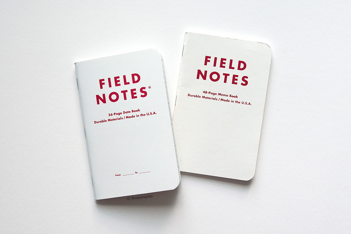
When Field Notes released Resolution last November, the white Date Book in that edition instantly reminded me of “Hardball White” memo book from Day Game, their 15th quarterly edition from Summer 2012. Both books have matte, white covers with red foil-stamped text, and Day Game being one of my favorite Field Notes editions, I couldn’t resist putting them side by side for comparison.

Day Game on the left, Resolution on the right.

Day Game on the left, Resolution on the right.

What we see here are:

  • Day Game “Hardball White” cover: French Paper Construction 100#C in “Recycled White”
  • Resolution Date Book cover: Mohawk Vellum 80#C in “Carnival Stellar White”

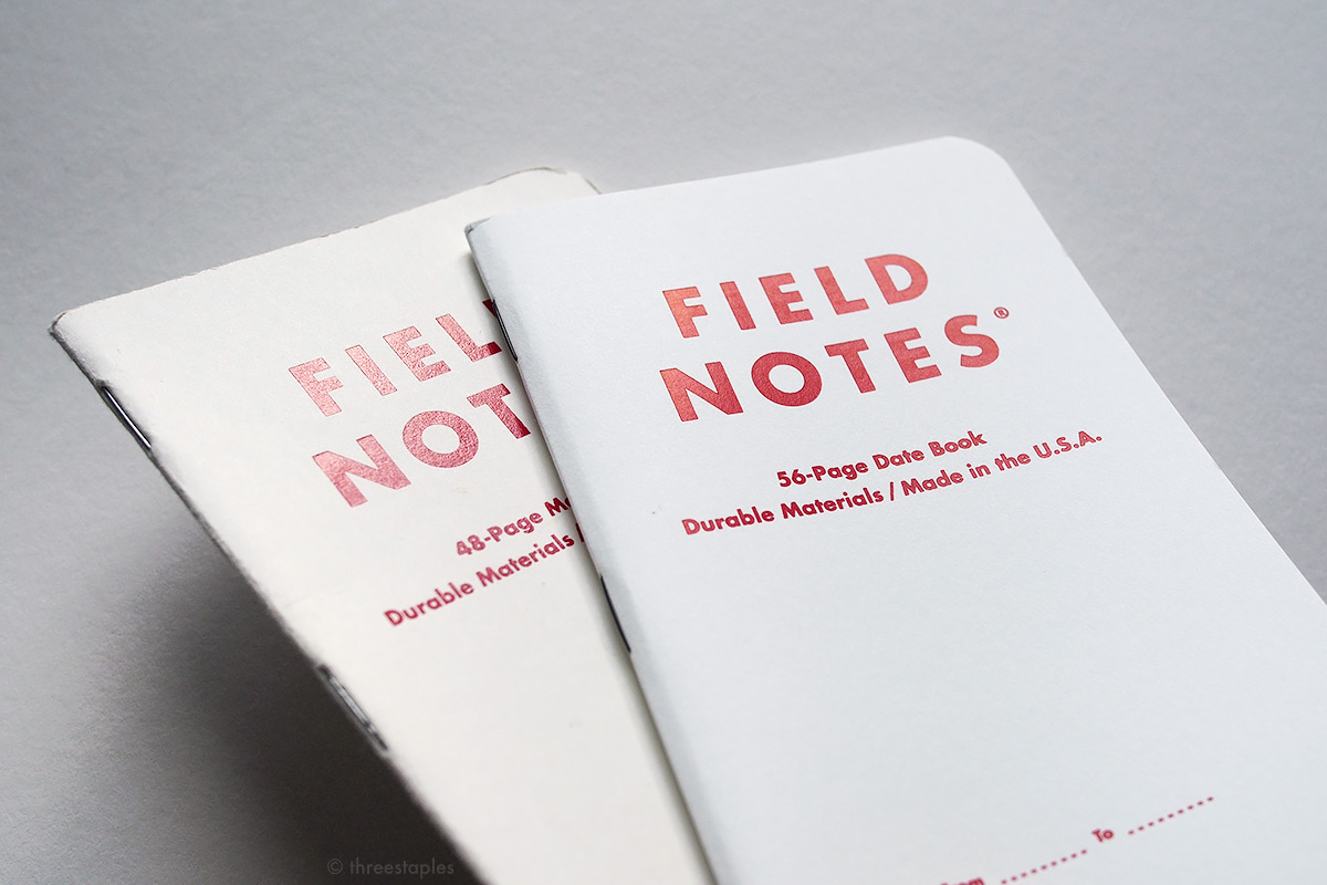
Pretty close! But the white in Day Game looks slightly warmer. Granted, the Day Game book shown here is a used copy, most likely dirtied over time, but I pulled out a brand new one, and it still looked slightly warmer. Interestingly, I can’t really tell the difference in the paper thickness, even though it’s 80#C vs. 100#C. As for the foil-stamping, maybe the red in Resolution looks slightly lighter?

threestaples-fn-ccomp-rdg-white-05.jpg

Other noteworthy differences:

  • Resolution is printed with dotted lines on the front (for dates and such), while Day Game has a small home plate design on its back cover.
  • Resolution features black staples, while Day Game is stapled with silver-colored staples.
  • The inside cover in Resolution is printed in medium gray. Day Game is printed in “Pinstripe Blue” ink.
threestaples-fn-ccomp-rdg-white-03.jpg
threestaples-fn-ccomp-rdg-white-06.jpg
threestaples-fn-ccomp-rdg-white-04.jpg
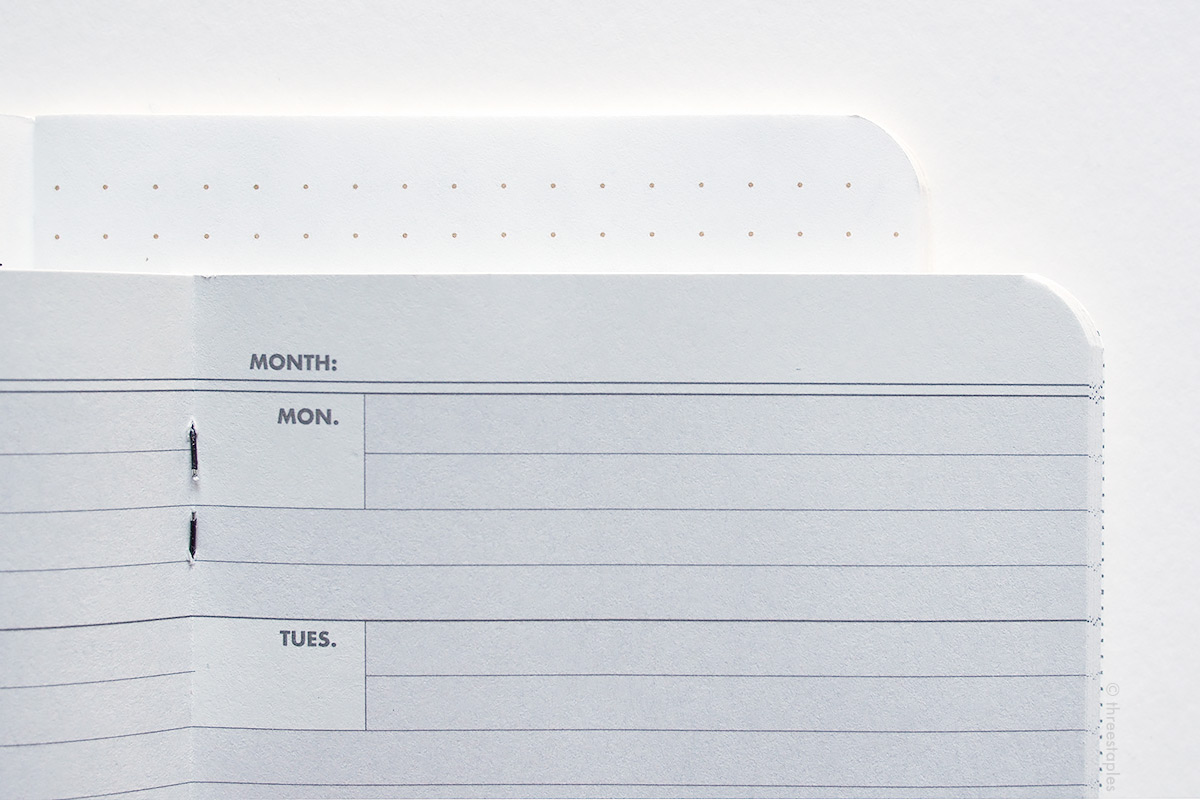
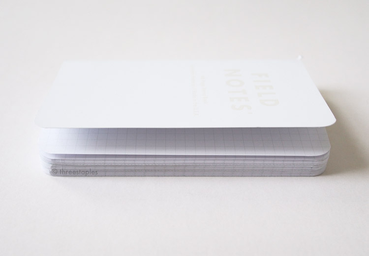
  • Resolution is a 56-page date book; Day Game is dot graph grid with 48 pages.
  • The body paper in Resolution is Domtar Earth Choice Vellum 60#T in “Gray” (previously seen in Lunacy), printed with “Frost White” and medium “Winter Sky Gray” inks. In Day Game, it’s the classic Finch Paper Opaque Smooth 50#T “Bright White” printed with “Double Knee Duck Canvas” light brown ink (what you see in many older Original kraft memo books).

I’m a big fan of this white + red combination, so I was really happy to see it again in Resolution. I imagine it was a welcome release for those who missed out on Day Game, too. I like that Field Notes is giving a taste of their classics to the newer fans, unintentionally or not. What are your thoughts on Resolution’s Date Book?

Related Links

  • I wrote about Day Game some time ago here.
  • Another old post on white Field Notes: Field Notes Color Comparison: White
  • Field Notes Resolution Review — Lead Fast
  • Field Notes Resolution Edition Review — The Finer Point
In FN Color Comparison Tags field notes, field notes color comparison, white, day game hardball white, day game, field notes resolution, domtar earth choice, mohawk paper, french paper construction, foil-stamped, datebook, dot grid
Comment
threestaples-fnc-sb-main.jpg

Field Notes Colors: Snowblind

March 2, 2016

Snowblind is a winter edition of Field Notes Colors, released in November 2015. Before its release, subscribers to Colors were teased with a blinding photo of the sun, and it turned out to be a relevant hint (even though Field Notes always says the teaser image is NOT a hint). Snowblind’s key selling point is that it changes colors in direct sunlight, due to the special “photochromic” ink printed on its white cover. Color-wise, I wasn’t surprised that this edition was all white, similar to how Northerly (another winter edition, from 2011) also had the snow theme. But I didn’t expect a color-changing edition! I should’ve seen it coming, since Field Notes have mentioned in the past how they tried to work with special inks like glow-in-the-dark inks.

threestaples-fnc-sb-01.jpg

Surprised or not, I very much looked forward to playing with Snowblind when it was first announced. Too bad my local weather wasn’t very sunny when I finally received my subscription, and I had to wait some time before I got a chance to expose my Snowblinds to direct sunlight. And boy was it fun! Watching the white covers turn blue was pretty exciting, and I even managed to make some patterns on them by masking.

I used a clear, decorative gift bag with a snowflake pattern..

Voilà!

I used the kit from Dry Transfer to lay out “2016” on a sheet of clear film..

threestaples-fnc-sb-16.jpg

Unfortunately, the novelty of Snowblind wore off pretty quickly for me. Maybe it was the gloomy and rainy “winter” weather here, or maybe it’s because I was spending more time with Snowblind using it, rather than playing with it. I use Field Notes indoors 99.99% of the time, which makes Snowblind simply a white-on-white notebook.

A white notebook that, I might add, starts looking dingy fast. This is in comparison with other white Field Notes, like Northerly or Day Game's “Hardball White”, which both hold up well. Of course, those two editions do show some wear and tear after a while, but Snowblind doesn’t seem to age as gracefully. Perhaps, without other colors and textures to distract me, the wear on Snowblind ends up looking more amplified. I’ve tried to “lift” some dirt off Snowblind with a kneaded eraser, which usually works on other matte covers, but that actually made things worse. I guess it has something to do with the special ink printed on the cover and the odd, slightly satin texture it creates.

threestaples-fnc-sb-12.jpg

I noticed that the blue ink used on the back cover doesn’t match the blue used on the inside cover. And did the belly band have to be yellow? I guess it did, to make the color-changing feature of Snowblind more obvious, in retail settings maybe, but the yellow in this edition doesn’t really do anything for me.

threestaples-fnc-sb-14.jpg

Okay, now I’m just nit-picking. That’s what happens when I feel “meh” about an edition (see my ranking of Field Notes to see how Snowblind fares). It's hard to pinpoint what makes Snowblind one of my least favorites, but I think it's the overall texture of it, how the cover is matte but lacks the fibrous feel (too smooth?). On top of that, it gets dirty quickly, when the beauty of its look (indoors) is dependent on it being pristine all over (even its staples are white).

threestaples-fnc-sb-05.jpg

But as a notebook, of course, it works just fine, and it fits my daily needs well. I like that Field Notes used a slightly thicker stock for the body pages again, and I enjoyed using the faint gray graph grid inside. Coupled with the light blue text on the white inside cover, Snowblind reminded me of a chilly winter landscape, even though my local weather didn’t match up. It also reminded me why I keep subscribing to Colors, and that is because I like seeing Field Notes books re-imagined in various ways, and I appreciate that they’re continuing to do trying different things every quarter. No doubt I’ll take a Snowblind out once in awhile and see its color change but as an every day memo book, it wouldn’t be my first choice. I have too many other Field Notes that I’m more drawn to. Blame it on all the special non-Colors editions lately for stealing the thunder, like the DDC Dead Prints?

threestaples-fnc-sb-11.jpg
threestaples-fnc-sb-08.jpg

Firsts

As mentioned above, the most significant “first” in Snowblind is the fact that it’s printed with a special “photochromic” ink that changes color when exposed to a specific range of ultraviolet light. The ink is actually screen-printed (which is another “first” in Colors), and since it reacts to UV light, it looks colorless indoors (or white in Snowblind’s case with the white cover stock), unless you use a special lamp (see here for more usage tips). Under a strong UV source, it turns blue in about 15 seconds. I definitely noticed that the direct sunlight produced a more saturated blue than when I tried to change the color with the sunlight filtered through the window. Either way, I was slightly disappointed that the blue reverts back to colorless very quickly, and it made photographing quite a challenge for me. Not that taking pictures of a white notebook is easy to begin with! :)

Apparently, this UV-sensitive pigment ink is very expensive, and Field Notes had to take “a bit of a hit in the ol’ profit-margin to get ’em into the world”. I wonder if that explains the smaller edition size of Snowblind, at just 25,000 3-packs (Shenandoah, the previous Colors edition, was 40,000 packs).

threestaples-fnc-sb-04.jpg

The other special ink on Snowblind is the “interference” ink, also custom-mixed and screen-printed by H&H Graphics – a printer I haven’t heard before through Field Notes (they also work with glow-in-the-dark inks! *nudge nudge*). This ink is used on the Field Notes logotype on the front cover. It’s a really pretty, pearlescent ink that almost disappears into the white cover at certain angles and sparkles with a hint of light blue at others. This is the part on Snowblind that doesn’t turn colors. I suppose FN could have left the logotype un-printed; that would have still produced the desired effect of the title standing out while the rest of the cover turns blue. But I’m glad they added some interest to an all-white cover with a hint of this sparkly ink. It goes well with the “snow blind” theme. I wonder how it would have looked if the whole cover was printed with this “interference” ink... :)

threestaples-fnc-sb-06.jpg

The last exciting “first” I’d like to mention is the appearance of glossy white staples in Colors. To avid Field Notes fans, Snowblind might not be the first, since the Starbucks Roastery “Coffee Origins” Edition and the Capsule A/W 2015 edition both featured white staples, but those were outside of the Colors series. For such a white edition like Snowblind, white staples is a no-brainer, and I’d love to see them again in Colors in the future.

By the way, Snowblind’s cover is made with Sappi McCoy 100#C Silk and it’s not a “first” in Colors. We’ve seen the same in Unexposed (Fall 2014). As for the body paper, Snowblind is not the first Colors edition to get the slightly thicker paper (Finch Paper Opaque Smooth in 60#T). Shenandoah is. I wondered if the 60#T would become a new standard.. Maybe it’s safe to assume that the next Colors edition would get the same body paper? We’ll just have to wait and see.

White staples of Snowblind, compared to the silver-colored staples of the Original kraft Field Notes.

White staples of Snowblind, compared to the silver-colored staples of the Original kraft Field Notes.

threestaples-fnc-sb-02.jpg

Other notes

Another thing I wondered at the time of Shenandoah’s release: whether the mini kraft “HELLO” note in the shape of a Field Notes would be packaged with future Colors editions. And it looks like that will be the case, as Snowblind was packaged with the same promotional note. I’ve also seen it tucked in other FN products, like the 56-Week Planner, the Steno, 15-Month Work Station Calendar, etc.

threestaples-fnc-sb-07.jpg
threestaples-fnc-sb-20.jpg

And this didn’t really affect my ranking, but I noticed that most of the books in my 3-packs of Snowblind have frayed edges at the corners where the cover is folded. I’ve seen this happen in other Field Notes but it seems especially bad in Snowblind. Maybe the assembly machine needs a stern talking-to. Who knows?

Last note: I’m glad all the books in Snowblind are the same, which means I don’t have to buy as many 3-packs this time. The last Colors edition before Snowblind that had 3 identical books was Shelterwood (Spring 2014). That’s a gap of almost two years. Wow!

Quick color comparison (left to right): J.Crew, Northerly, National Crop “Cotton”, Day Game “Hardball White”, TEDx Portland, Capsule AW 2014, Capsule AW 2015, and Snowblind. For more detailed (but slightly outdated now) “white” comparison, go here.

Quick color comparison (left to right): J.Crew, Northerly, National Crop “Cotton”, Day Game “Hardball White”, TEDx Portland, Capsule AW 2014, Capsule AW 2015, and Snowblind. For more detailed (but slightly outdated now) “white” comparison, go here.

Snowblind (right) vs. the other white winter edition, Northerly (left).

Snowblind (right) vs. the other white winter edition, Northerly (left).

Some yellow belly bands with Packet of Sunshine thrown in (upper right): Snowblind (front), Coal x DDC (left), and Loot Crate “Classified” edition (upper left).

Some yellow belly bands with Packet of Sunshine thrown in (upper right): Snowblind (front), Coal x DDC (left), and Loot Crate “Classified” edition (upper left).

Quick graph grid comparison (from left): Northerly, Cold Horizon, Just Below Zero, Snowblind, and Original kraft.

Quick graph grid comparison (from left): Northerly, Cold Horizon, Just Below Zero, Snowblind, and Original kraft.

Some fun (for me) details

  • Snowblind is the 2015 Winter edition of COLORS, the 29th in the series.
  • Item Number: FNC-29
  • Edition size: 25,000 packs, November 2015. FN offered 1,000 new subscriptions starting with this edition.
  • Covers: Sappi McCoy 100#C “Silk White” silk-screened with two custom inks: pearlescent “Interference Blue” ink and “Photochromic Blue” ink, by H&H Graphics in Vernon Hills, IL. Ink information of the blue text on the back cover is unknown, as is the lighter blue ink used on the inside cover.
  • Body paper: Finch Paper Opaque Smooth 60#T in “Bright White”
  • Graph grid inside: “Hoar Frost” light gray, soy-based Saphira ink
  • Belly band: yellow with black text
  • Subscription-only extras: none
  • Extras: “Hello” note with No. FN-25 “Sincere Pronouncement,” packaged in between the memo books
  • Staples color: white
  • Film: Field Notes Winter 2015 on Vimeo
     

My Favorite “Practical Applications”

  • #15. Yeti Sightings
  • #20. Polar Bear Plunges Plunged
  • #28. Moose Avoidance Plans
     

Fellow Field Notes fans’ takes on Snowblind

  • Notes on Snowblind Field Notes | Pens and Junk
  • Field Notes COLORS: Snowblind — M B S-P-B

What are your thoughts on Snowblind? :)

In Field Notes Colors Tags field notes, winter edition, white, sappi mccoy, snowblind, white staples, graph grid, screen-printed
4 Comments
Older Posts →

WELCOME

I’m Jinnie!

✿(。◕‿◕。)☆彡

Twitter: @threestaples

Instagram: @threestaples

Subscribe: RSS


COPYRIGHT

© 2014–2020 Three Staples. All Rights Reserved. Please DO NOT use any part of this site, especially pictures, without permission. I’m being serious. Please see ABOUT page for details. 


Field Notes by Theme

Field Notes Item Numbers


LEGIT “PRESS”

February 2015 was HUGE for me, you guys. I got some shout outs directly from Jim Coudal and Field Notes.

And another one!

Thanks for that. :)


LATEST ENTRIES

Featured
threestaples-FN-IGpolls-Wilco2019-00.jpg
Nov 15, 2019
Field Notes: Instagram Polls (Part 6 - Wilco)
Nov 15, 2019
Nov 15, 2019
threestaples-fn-ccomp-ggray-P9044884-main.jpg
Nov 4, 2019
“Grout Gray” Field Notes
Nov 4, 2019
Nov 4, 2019
threestaples-PA165046-hangers1.jpg
Oct 18, 2019
Field Notes DIY: Non-slip hangers with Bands of Rubber
Oct 18, 2019
Oct 18, 2019
threestaples-FN-IGpolls-NationalParks2019-00.jpg
Oct 15, 2019
Field Notes: Instagram Polls (Part 5 - National Parks)
Oct 15, 2019
Oct 15, 2019
threestaples-FN-IGpolls-Summer2019-00.jpg
Oct 11, 2019
Field Notes: Instagram Polls (Part 4 - Summer Editions)
Oct 11, 2019
Oct 11, 2019
threestaples-FN-IGpolls3-00.jpg
May 21, 2019
Field Notes: Instagram Polls (Part 3 - Mile Marker)
May 21, 2019
May 21, 2019
threestaples-FN-IGpolls2-00.jpg
Mar 26, 2019
Field Notes: Instagram Polls (Part 2 - Spring Editions)
Mar 26, 2019
Mar 26, 2019

Archive
  • November 2019
  • October 2019
  • May 2019
  • March 2019
  • July 2018
  • June 2018
  • May 2018
  • April 2018
  • March 2018
  • February 2018
  • January 2018
  • December 2017
  • November 2017
  • October 2017
  • September 2017
  • August 2017
  • July 2017
  • June 2017
  • May 2017
  • April 2017
  • March 2017
  • December 2016
  • November 2016
  • October 2016
  • September 2016
  • August 2016
  • July 2016
  • June 2016
  • May 2016
  • April 2016
  • March 2016
  • February 2016
  • January 2016
  • December 2015
  • November 2015
  • October 2015
  • September 2015
  • August 2015
  • July 2015
  • June 2015
  • May 2015
  • April 2015
  • March 2015
  • February 2015
  • January 2015
  • December 2014
  • October 2014
  • September 2014
  • August 2014
  • July 2014
  • June 2014
  • May 2014
  • April 2014
  • March 2014

MY WISHLIST

  • Gimme all of these. Stat.


Some Amazon.com links on this site may be affiliate links, which means: if you follow these links and make a purchase, I will receive a small commission. You will not pay more by clicking through these links. Every little bit will help fund the hosting of Three Staples, so your support would be greatly appreciated. Thanks!


Copyright © 2014–2020 Three Staples. All Rights Reserved. Please do not use any part of this site without permission.