Workshop Companion is the 27th in Field Notes COLORS series. It was released in early June as the 2015 summer edition, just in time for Father’s Day on June 21st. It’s a boxed set containing six different memo books that feature the newest paper line from French Paper Co. Subscribers were teased at the end of May with a picture of a breaker box, and it turned out to be pretty indicative of the new edition. Workshop Companion has an obvious home improvement theme, with each book representing one DIY discipline: Wood Working, Automotive, Gardening, Painting, and Electrical. I received my set right around the time it was revealed, and it came with a subscribers-only toolbox magnet. Very neat.

With 17,000 boxes made, Workshop Companion is a smaller edition, if you don’t consider the actual number of books. The previous COLORS edition, Two Rivers, had 25,000 3-packs, and the edition before that, Ambition, had 30,000 3-packs. However you choose to think about the edition size, I have no doubt Workshop Companion will sell out; it’s an impressive set with many details that old and new Field Notes fans can appreciate.
Love the bold, orange title on the spine.
One of the most unique details in Workshop Companion is the hexagonal motif. Each DIY discpline has its own illustration designed inside a hexagon, and it’s prominently printed on each front cover. The set also comes with a sheet of decals featuring the same 6 hexagons. The geometric theme, which is quite on-trend these days I think, can be found on the the matching magnet, and of course on the black slipcase. Even the lining inside the slipcase features a sleek, dark hexagonal pattern. As always, such attention to detail by Field Notes is one of the exciting things to look forward to in a new edition.

Other details that make Workshop Companion interesting, and similar in spirit to County Fair and National Crop: references printed on the back covers. Each book features a quote, pro tips, lists of common tools of the trade and jargons, a “great moment” in the trade, and diagrams. Reading the “Tradesmen of Note” made me chuckle a few times, too.

Some of the notable tradesmen in the Plumbing book: Mario and Luigi.
Plenty of impressive details don’t automatically mean I love Workshop Companion. I don’t know how Field Notes came to decide on the “color” for this edition, but with such specific DIY appeal, I can see how they came to focus their marketing for Father’s Day. “Your dad called. He wants one”, they said. But I find it too stereotypical (my dad has no interest in any of the chosen DIY), and I find it too specific in its use-case for me. It’s not that I don’t have any interests in home improvement; I just want my notebooks to be versatile. The worshop theme isn’t new; we saw it in American Tradesmen back in 2011, also a summer edition. But it was mildly suggestive and limited to the product photos and description, not printed on the actual product’s covers. With Workshop Companion, it’s quite direct with the cover in several places indicating what each book is for. The fact that the spines are labeled and everything housed in a slipcase is pretty indicative of the purpose of this edition, too.
Despite the Father’s Day theme that was immediately lost on me, my reaction to Workshop Companion was initially positive. I was very excited that it was a different kind of a boxed set, and I couldn’t wait to see it in person. It’s so photogenic! When I finally did, I found the cover design a bit overdone, like Workshop Companion’s own “branding” is competing with that of original Field Notes. I’m no professional designer, so I won’t attempt to provide an intelligent critique here. I just feel that Workshop Companion was designed to be a gift, with lots of eye-catching details. Perhaps that is the goal of this edition, for Field Notes to reach new customers and wholesalers and expand their business. But as a long time user and subscriber of Field Notes with a simpler taste, and as someone who can never find the right Father’s Day card, I find Workshop Companion a bit frustrating.
I know, I can ignore the labels and use them for whatever I want. And I did, for several weeks, because I was excited about the new French paper and wanted to test it. But I didn’t enjoy it (more on this below). I’m not opposed to FN trying something new; it is after all what the COLORS series is for. But for me, Workshop Companion deviates a little too much from the original versatility and simplicity of Field Notes that I’ve come to love.
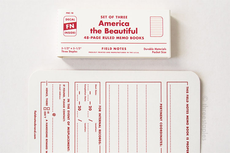
Don’t get me wrong, I still love Field Notes. I absolutely understand if they feel they have to outdo themselves every quarter. I might still get another set for posterity. And I’ll eagerly wait for the next seasonal release, while enjoying America the Beautiful or National Crop, which were different but still simple and versatile.
Firsts
Workshop Companion is not the first COLORS edition to come as a boxed set; National Crop (Spring 2012) was the first. Both editions’ boxes are made by Jessup Paper Box but while National Crop comes in a clamshell box, Workshop Companion comes in a custom slipcase. For packaging and display purposes, I think this slipcase is an improvement. I like that Workshop Companion came shrink-wrapped; National Crop’s box was simply shut with a round, clear sticker on the lid and not shrink wrapped. I remember seeing them in stores pretty beat up, with the sticker peeled and some unsightly sticky residue left behind. One thing I noticed with the slipcase is that the books end up packed in pretty tight, and the black ink from the “Tools of the Trade” part on the back rubs off onto the adjacent front cover. (No biggie, I took care of the “smudges” with a kneaded eraser.)

Spines with brass staples. Luckily, most of the staples were well centered this time.
A very notable “first” with Workshop Companion: the spines are colored and labeled. With the slipcase, this extra feature makes for a nice presentation, and I would think that it helps in retail settings, unlike the clamshell box. The brass-colored staples (a first!) block some of the text but it’s a good thing that they are dull and blend in well with the overall color scheme.
As mentioned at the top, Field Notes used the newest line of paper from French Paper called Kraft-Tone. Not only is it the first time Field Notes using Kraft-Tone in COLORS, they got to see and use this new paper even before the line was released (read more about it here). Since I’m a fan of French Paper covers, I was very excited about this, and in person it does not disappoint. I really wish the cover design had more breathing room for the texture of the paper to shine through. Hopefully, this is not the first and last time we see Kraft-Tone in COLORS.
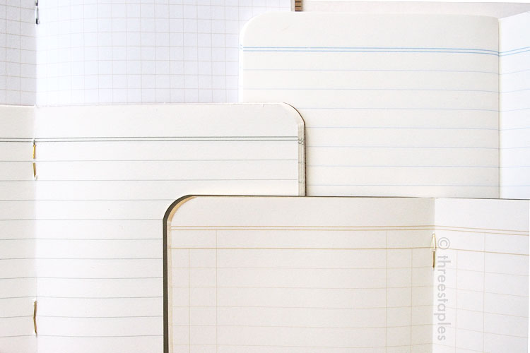
These two show off the texture of Kraft-Tone particularly well.

I have no detailed information on the metallic composition of FN staples but I see “silver” peeking out of the “brass” staples!
Workshop Companion is the first time in COLORS that we see the body paper from French Paper, Kraft-Tone 70#T in “Standard White Kraft”, to be more specific. So far the innards have mostly been Finch Paper. As for the paper weight, it’s not the first time we see the thicker 70#T. But it is the first time we’re seeing it in dot grid, instead of the ruled style (America the Beautiful from Spring 2013 and Shelterwood from Spring 2014) or the ledger-style (Traveling Salesman from Fall 2012). I really like dot grid, so I’m sad to say I didn’t really like writing on this one. Yes, it’s thick enough for fountain pens, but my pens – gel and fountain – don’t glide on it as well as they do on the previous 70#T innards. Maybe if I weren’t so critical of this edition already, I would be more forgiving. Too bad for me because Kraft-Tone looks fantastic even as innards. The fibrous look isn’t too distracting for writing, and the slightly-off-white color is always a plus in my book.
Quick dot grid comparison (from top): Workshop Companion, Day Game, Pitch Black, and Fire Spotter
Quick innards comparison (from left): Original Kraft, Workshop Companion, America the Beautiful, Shelterwood, and Ambition. Workshop is warmer than Original but not as off-white as the rest.
I’m pretty sure this is a first but with the release of Workshop Companion, Field Notes sponsored a bunch of podcasts, including many I enjoy on Relay.fm. With a special code, subscriptions to COLORS came with three free Carpenter Pencils (how appropriate!) and a pack of Pitch Black. I’m already subscribed but this deal was pretty tempting. I’ve seen Field Notes advertise on a few print magazines before but hearing the sponsorship on Pen Addict was pretty sweet. Perhaps this is another indication of FN trying to expand and testing new waters? It’d be interesting to learn how many people subscribed through the podcast sponsorship, if they ever divulge that information. ;)
Not sure where I’ll use these decals...
Words of wisdom, not just in the workshop. Love it.
Some fun (for me) details:
- Workshop Companion is the 27th edition in the Field Notes COLORS series (summer 2015).
- Item Number: FNC-27, printed on the box. Each book is numbered FN WCS 01 through 06 on the spine (WCS for Workshop Companion Series).
- Edition size: 17,000 boxes, dated June 2015 on the back cover. FN offered 1,000 new subscriptions with this edition.
- Cover paper: 6 covers in 6 different French Paper Kraft-Tone 100#C, each printed with two soy-based Saphira inks. Books are numbered as follows, with corresponding Kraft-Tone paper color:
- FN WCS 01: Wood Working: “Parcel Wrap”
- FN WCS 02: Automotive: “Manila Yellow”
- FN WCS 03: Gardening: “Ledger Green”
- FN WCS 04: Painting: “Chip Board”
- FN WCS 05: Plumbing: “Index Off-White”
- FN WCS 06: Electrical: “Memo Orange”
- Inside covers: Text printed in black, including “Practical Applications”, are the same across all six books.
- Dot grid inside: “Maple Lacquer” light-brown soy-based Saphira ink
- Paper inside: French Paper Kraft-Tone 70#T in “Standard White Kraft”
- Extras:
- Custom 60-pt slipcase made by Jessup Paper Box (Lafayette, Indiana), same folks who made the National Crop's clamshell box.
- FNC27a: One sheet of peel-and-stick toolbox ornamentation decals.
- FNC-27b: One Workshop Reminder Magnet in a small clear bag, 1.25” diameter, for subscribers only.
- Belly band: none
- Staples color: brass
- Film: Field Notes - 'Workshop Companion' on Vimeo
My Favorite “Practical Applications”
- 09: Warranties Broken
Not many fun ones to choose from. This edition’s “Practical Applications” actually sound... practical. Go figure!

Phew, this was a tough post for me to write, and I suspect many of the COLORS editions I haven’t written about yet will be tough as well, if not tougher. Not coincidentally, many of the remaining editions are near the bottom of my FN ranking... But I promised myself I would go through them all. Can’t stop, won’t stop!
What are your thoughts on Workshop Companion? Which one did you start using first? I used the 4th one, Painting, mostly for the color. I may not use another one any time soon, but I really do enjoy the hexagonal motif. It reminds me of bee hives and the “Worky work, busy bee!” commercial. 😊🐝