• Home
  • About
  • Journal
  • Archive
  • My Field Notes
  • Links
Menu

Three Staples

a stationery site by jinnie
  • Home
  • About
  • Journal
  • Archive
  • My Field Notes
  • Links
threestaples-fnc-sw-01.jpg

Field Notes Colors: Shelterwood

April 6, 2017

I’m continuing on my journey to write about every quarterly edition of Field Notes that I have, with a few exceptions. Last time, I wrote about Cold Horizon, and I’m choosing Shelterwood next, which was the next seasonal edition right after Cold Horizon. As usual, I’ll talk about the major “first” features in Shelterwood, with my own opinions mixed in, and end with a list of specifications and links.

Shelterwood came out in spring of 2014, and was the 22nd release of the Field Notes quarterly edition series. It was a very popular edition, and if I remember correctly, it sold out within just a few months. At the time, Field Notes said it was one of the fastest selling editions ever, along with Raven’s Wing and Night Sky. They must have been pretty confident that Shelterwood would do well, because they also made Cherry Graph, a very close cousin of Shelterwood, at the same time and introduced it later as a standard, open-ended edition.

I received Shelterwood as part of my COLORS subscription. I agree with many Field Notes fans: Shelterwood is a solid edition. It’s visually simple but has enough special features – like thick, off-white interior paper, ruling in soft green lines, gold staples, and real wood cover – that make it a very beautiful, tactile edition. The wood cover makes me want to keep touching it, and, along with Cherry Graph, Shelterwood has become one of the “easier” options whenever I want to choose the next Field Notes to use.

Each book features a unique pattern.

The cover in Shelterwood tends to curl open more than other editions. It can be a bit annoying at times but Field Notes has never laid flat for me anyway (open or closed).

The “Ghost Flower” white ink on the uncoated cover can look barely there at certain angles..

.. and more visible at others. I really like how this ink looks like it’s just sitting on the surface.

Firsts (and seconds)

Shelterwood was the first Field Notes COLORS edition, and the only one so far, to have a real wood cover. American Cherry wood from Northern Illinois and Southern Wisconsin, to be more specific. Their Shelterwood page and film (a must watch) describe this much better than I can but basically, the wood is very thinly sliced into sheets and then bonded to brown kraft paper (you can see the kraft paper on the inside cover). I remember seeing stationery companies using thin sheets of wood for some time before Shelterwood came out, in the form of postcards and greeting cards, for example, so I wasn’t terribly surprised or impressed when Shelterwood was first announced. But I was amazed Field Notes was able to make the cover so pliable and durable. Field Notes said they were the first notebook company to manufacture such a product at a large scale. Whether that’s true or not, the result is still noteworthy. At first I was afraid the wood grain would splinter or chip off at the edges over time, but I haven’t had any issues (I’m pretty gentle with my notebooks in general though). Some books came with some tiny bits of wood missing on the spine but it hasn’t gotten any worse with use. Bryan Bedell (of Field Notes) mentioned that he carried Shelterwood in his back pocket for a few months in order to test the durability of the cover (listen to the excellent Erasable Podcast episode #28, at about 57 minutes in).

The 70#T body paper in Shelterwood feels great, too. Although it’s not a requirement for me, I appreciate the thicker weight for versatility (for both gel pens and fountain pens), and I really enjoy writing on it, especially with the off-white color and muted green ruled lines. By the way, Shelterwood is the 3rd Colors edition to get the 70#T paper, after Traveling Salesman from Fall 2012 (Mohawk Via Smooth), and America the Beautiful one year before Shelterwood. Shelterwood actually uses the same paper stock used in America the Beautiful: Finch Paper Fine in “Soft White”. That makes Shelterwood the second in the Colors series to get off-white innards. Black Ice, from winter 2016, also uses Finch Paper Fine 70# but in “Bright White” color.

A quick off-white innards comparison, from top: Ambition, Shelterwood, America the Beautiful, Workshop Companion, and Original Graph.

Gold staples and white ink on wood cover

Ruled lines (1/4") and gold staples

Other features in Shelterwood that are not “firsts” in the quarterly editions but still noteworthy: gold staples and 1/4” ruled lines. Drink Local (Fall 2013) was the first edition with gold staples, and America the Beautiful (again!) was the first to get ruled lines, making Shelterwood 2nd. I think the gold staples were a great (perhaps an obvious) choice for Shelterwood, since they complement the warmth of the wood cover so well. As for the ruling, I don’t mind it at all. I use graph grid a lot but there are times when I miss writing in ruled notebooks, and Shelterwood has been a good option at such times.

 Some Field Notes with ruled lines (clockwise from top right): Black Ice, Shelterwood, America the Beautiful, Arts & Sciences (the Arts book), and Original Ruled.

The green on the belly band matches the green ruling on the innards. It goes really well with the wood color in my opinion.

Considering the interior paper, it might be easy to group Shelterwood together with America the Beautiful. But to me they have vastly different personalities, and that is in no doubt due to Shelterwood’s real wood cover. I really enjoy its texture, how the grain shows through the white ink, and how each cover has a unique pattern. But it’s not just the fact that it’s made out of wood that impresses me. Field Notes decided to keep the overall design simple and classy, with just a few accents, and it has great innards to boot. Shelterwood is one of those editions that I can’t help but like (and appreciate) more and more over the years. It’s not one of my top 10 favorites, not because there are things I dislike about it but because there are so many editions that I’m more drawn to. Just like America the Beautiful, I suspect Shelterwood will fluctuate constantly in that difficult range between #11 and #20 in my Field Notes ranking.
 

Some Field Notes with gold staples (from top): Drink Local, Shelterwood, Cherry Graph, Ambition, and Capsule (SS 2016).

Inside front cover

Love how the mossy green “Twilight Sage” ink looks almost soft gray on the kraft paper.

Some fun (for me) details

  • Shelterwood is the 2014 spring edition of COLORS, the 22nd in the series.
  • Item number: FNC-22
  • Price: $9.95/pack of 3 books
  • Edition size: 25,000 packs, or 75,000 books, March 2014. Cold Horizon, the previous edition, was 20,000 packs.
  • Printed by: Burke Printing in Lake Forest, Il.
  • Cover: Graphic Wood Technologies PureVeneer cherry wood veneer, bound to brown kraft paper, printed with “Ghost Flower” white
  • Inside cover: brown kraft paper printed with text in “Twilight Sage” green soy-based Toyo ink
  • Body paper:  Finch Paper Fine 70#T in “Soft White”, same as America the Beautiful
  • Ruled lines inside (1/4"): “Maidenhair” light green soy-based Toyo ink
  • Edition-specific extras: none
  • Belly band: off-white paper with background printed in matching light green ink
  • Staples color: gold
  • Teaser image in “A Note to Colors Subscribers” email: a photo of a Northern Wisconsin sunset.
  • Film: Field Notes Brand: The Shelterwood Edition on Vimeo ⬅︎⬅︎⬅︎ must watch
  • Film: FN - Recap 2014 on Vimeo ⬅︎⬅︎⬅︎ this too

Field Notes with wood: Starbucks Roastery Edition (with birch) on the left, Cherry Graph and Shelterwood on the right, both with cherry wood. The Shenandoah belly band on the top also features birch veneer.

My Favorite “Practical Applications”

  • #10. Flannels Inventoried
  • #11. Carbons Dated
  • #25. Maple Syrup Tasted
  • #30. Legendary Splinters

A few more suggested applications in the Shelterwood announcement email from Field Notes:

  • Pegboard Tool Organization Schema
  • eBay Listing Inventory for All That Crap in the Garage
  • Things Everyone Loves That Are Totally Overrated


Related Links

  • Review: Field Notes Shelterwood Edition – Owl Ink
  • Shelterwood — The Gentleman Stationer
  • Field Notes Shelterwood: A Review — The Finer Point
  • Andy Hullinger shares how he tanned his Shelterwood without staining (via Field Notes)
  • Shelterwood gets featured in a music video

What are your thoughts on Shelterwood? I may have squirreled away a few packs for backup but I take comfort in knowing that Cherry Graph is available and in stock.

 

In Field Notes Colors Tags field notes, shelterwood, gold staples, field notes shelterwood, wood, cherry wood veneer, cherry graph, spring edition, ruled, off-white, burke printing
2 Comments
threestaples-fn-atb-mc2.jpg

Field Notes Colors: America the Beautiful

February 23, 2015

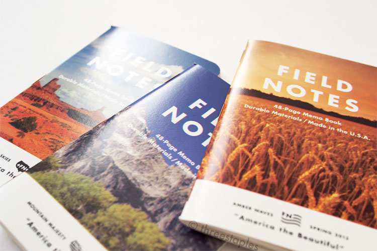
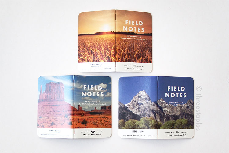
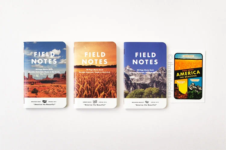
America the Beautiful is the 18th in the Field Notes Colors series. It was released in March 2013 as the spring edition but I didn’t get it until several seasons later. The photographic covers just didn’t do anything for me at first. I understood what Field Notes was going for, that vintage look with over-saturated colors and imprecise printing. It just wasn’t an instant attraction, so I passed it up several times at my local stores. Many others must have felt the same way as I did because America the Beautiful didn’t sell out until almost a year later, in February 2014. But I kept hearing good things about its body paper, and as a Field Notes fan, I felt I needed to at least give it a try. Once I did, I was instantly charmed by its quirkiness. I blame the “Spacious Skies” book, the one that’s packaged on the very front of the 3-pack with the desert landscape, for not convincing me initially. I knew the edition had three different covers but I had no idea how nice the “Amber Waves” (wheat field) book would look by itself. Had it been packaged with “Amber Waves” or “Mountain Majesty” on the front, I might have gotten this edition much earlier. Just goes to show you, there’s just something about seeing and feeling them in person that can change your opinions.

Why do I find America the Beautiful charming? It’s hard to pinpoint. I think it’s a case of the whole being greater than the sum of its parts. I like that the heavyweight cover is coated on the outside but is not too glossy, and that the inside cover is matte. I may not be a big fan of photographic covers but I find the cover layout really well balanced with just enough details. I didn't really think about it until now but somebody had to solve that challenge of putting an image in an already-well-established layout, and I think the Field Notes team makes it look easy.

And as other FN fans have noted before me, the body paper is great. It’s slightly cream-colored, a bit thicker than usual, and smooth. Much better for fountain pen users but this edition seems to be a favorite among pencil enthusiasts as well. I really like the combination of the light blue lines and the red text on the off-white inside covers, too, which is fitting for another edition paying tribute to America.

Images wrap around the back.

Images wrap around the back.

Firsts

The most unique characteristic of America the Beautiful is that it’s the first time Field Notes used images on the covers, instead of flat, solid colors.

And the images wrap around the back! They are printed in over-saturated colors and off-register on purpose to look like the American vintage memo books from the 1950s and 60s. If you look closely, you can see the actual CMYK dots that make up the image, and how they’re slightly misaligned. You can see the effect more easily at the edges of the white Field Notes logotype and the white band on the bottom.

See how the magenta and cyan make up the sky color?

See how the magenta and cyan make up the sky color?

It's not your eyes.

It's not your eyes.

I thought the images were made “fuzzy” on purpose digitally before they were printed, but no, Field Notes actually worked with their printer to have the images come out that way on press. Apparently, it was quite a challenge because modern printing machines are designed and calibrated to avoid producing such print jobs but Field Notes made it happen. According to Bryan Bedell in the 2013 recap video, they had to actually fiddle with the rollers so that they would print off-register. I am no printing expert but that sounds like a big deal.

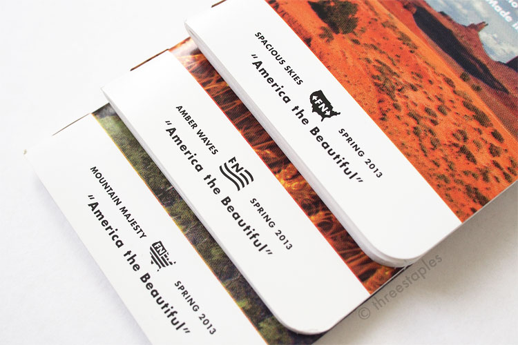
This is not the first time extra texts and graphics are added to the covers (see National Crop and County Fair) but it’s interesting to note that the images in America the Beautiful are not full-bleed and that the extra graphics are placed inside a solid white band on the bottom of each book. This style is another nod to the vintage agricultural memo books that inspired the original Field Notes. I think it really ties everything together. And check out how the “FN” icon is different in each book.

The cover stock is from Mead Westvaco; this is the first time we get this paper in Colors (and the only time, as of February 2015). It’s not the first time we encounter coated covers (see Northerly and Expedition) but America the Beautiful decidedly feels different because it’s coated only on one side and is not overly glossy.

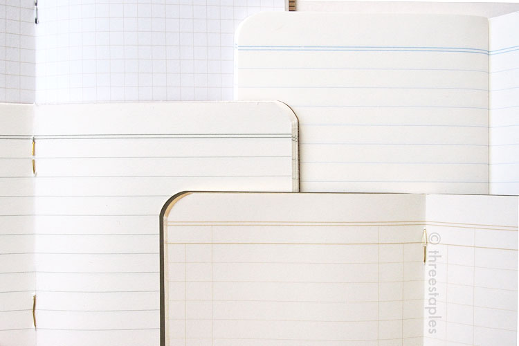
As for the body paper (innards), America the Beautiful is in many ways similar to Traveling Salesman, an earlier edition from Fall 2012. Both editions have thicker 70#T innards that are non-white and ruled, with some blank header space at the top of each page. But while Traveling Salesman is ruled in ledger style, America the Beautiful has what you’d consider “regular” ruled lines, with 1/4" spacing. (That is the same spacing found in Traveling Salesman and later in Shelterwood and Arts & Sciences.) And America the Beautiful’s body paper is off-white (Finch), instead of green in Traveling Salesman (Mohawk Via). I would consider this the first regular ruled edition in Colors. And the first off-white edition! Because I like off-white innards and Northerly’s grey doesn’t count.

Original kraft innards (top left) compared to off-white innards, from top-right to bottom: America the Beautiful, Shelterwood, Ambition. America the Beautiful and Shelterwood use the same paper, Finch Paper Fine 70#T.

Original kraft innards (top left) compared to off-white innards, from top-right to bottom: America the Beautiful, Shelterwood, Ambition. America the Beautiful and Shelterwood use the same paper, Finch Paper Fine 70#T.

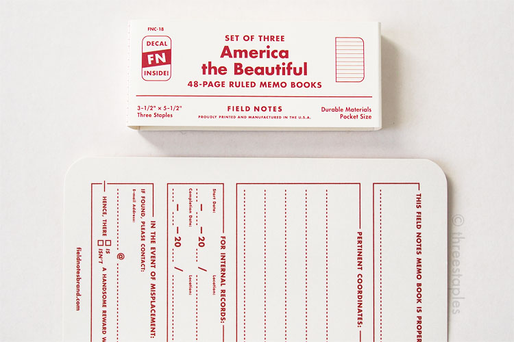
Belly band matches the inside cover. Note the decal icon on the left.

Belly band matches the inside cover. Note the decal icon on the left.

This is also the first time we see a water-transfer decal as a bonus. It's appropriately labeled FN-18a. It’s not the first time an extra item is packaged inside the 3-pack between the memo books (e.g. the temporary tattoo in Fire Spotter, Fall 2011) but unlike Fire Spotter, the bonus is advertised on the belly band on the front. Despite the instructional video on how to apply the decal, I have not used mine.

Copper staples

Copper staples

Last but not least, note the staples! America the Beautiful is the first edition in Colors to break the tradition of silver staples. The staples are copper-colored! This is a huge first in my book. I think the copper staples definitely add to the rustic, chunky image of America the Beautiful. Although, I should mention, they really did become rusty over the years, more so than the other editions’ staples.

Rusty copper staples

Back view

Inside view comparison: America the Beautiful (top) vs. American Tradesman (bottom). I prefer the cream color of America the Beautiful.

Inside view comparison: America the Beautiful (top) vs. American Tradesman (bottom). I prefer the cream color of America the Beautiful.

I may not subscribe to the whole vintage 60s look or the American road trip aesthetic but there's something very satisfying about America the Beautiful. It feels substantial yet comfortable in my hands, and all the details make me appreciate Field Notes for sticking with their vision and seeing it through.

Some fun (for me) details:

  • America the Beautiful is the 18th in the COLORS series (Spring 2013).
  • Item Number: FNC-18
  • Edition size: 45,000 books, March 2013.
  • Three different memo books per pack:
    • “Spacious Skies”
    • “Amber Waves”
    • “Mountain Majesty”
  • Cover paper: Mead Westvaco Tango in 15pt, coated on the front.
  • Inside cover: matte with text printed in “Blood Red” soy-based Toyo ink.
  • Paper inside: Finch Paper Fine 70#T in “Soft White,” same as Shelterwood.
  • Ruled lines inside: “Looseleaf Blue” soy-based Toyo ink
  • Extras: a colorful water-transfer decal “FNC-18a” made by Art Decal Corp., Long Beach, CA.
  • Belly band: Matching cream color with red text and an icon for the enclosed decal
  • Staples color: copper
  • Film: America the Beautiful on Vimeo, shot in Illinois with this crew.
  • Film: FNC-18a Water Transfer Decal Instructions, on Vimeo
  • Film: An Obsessive's Guide to Field Notes COLORS: Part Five (2013) on Vimeo

My Favorite “Practical Applications”:

  • #11. Bird Call Cheat Sheet
  • #15. Summits Summitted
  • #24. Bathtub Gin Recipe

Did you need convincing to get America the Beautiful or was it a no-brainer? Which book among the three is your favorite? I think my ranking for this edition will constantly change. These days, it floats somewhere between #11 and #16, which is my not-head-over-heels-but-definitely-not-meh range. But who knows how things will change as more editions are released!

In Field Notes Colors Tags field notes, america the beautiful, full-color, spring edition, ruled, copper staples, meadwestvaco, off-white, extras, decal, one-side-coated, coated covers
2 Comments
Older Posts →

WELCOME

I’m Jinnie!

✿(。◕‿◕。)☆彡

Twitter: @threestaples

Instagram: @threestaples

Subscribe: RSS


COPYRIGHT

© 2014–2020 Three Staples. All Rights Reserved. Please DO NOT use any part of this site, especially pictures, without permission. I’m being serious. Please see ABOUT page for details. 


Field Notes by Theme

Field Notes Item Numbers


LEGIT “PRESS”

February 2015 was HUGE for me, you guys. I got some shout outs directly from Jim Coudal and Field Notes.

And another one!

Thanks for that. :)


LATEST ENTRIES

Featured
threestaples-FN-IGpolls-Wilco2019-00.jpg
Nov 15, 2019
Field Notes: Instagram Polls (Part 6 - Wilco)
Nov 15, 2019
Nov 15, 2019
threestaples-fn-ccomp-ggray-P9044884-main.jpg
Nov 4, 2019
“Grout Gray” Field Notes
Nov 4, 2019
Nov 4, 2019
threestaples-PA165046-hangers1.jpg
Oct 18, 2019
Field Notes DIY: Non-slip hangers with Bands of Rubber
Oct 18, 2019
Oct 18, 2019
threestaples-FN-IGpolls-NationalParks2019-00.jpg
Oct 15, 2019
Field Notes: Instagram Polls (Part 5 - National Parks)
Oct 15, 2019
Oct 15, 2019
threestaples-FN-IGpolls-Summer2019-00.jpg
Oct 11, 2019
Field Notes: Instagram Polls (Part 4 - Summer Editions)
Oct 11, 2019
Oct 11, 2019
threestaples-FN-IGpolls3-00.jpg
May 21, 2019
Field Notes: Instagram Polls (Part 3 - Mile Marker)
May 21, 2019
May 21, 2019
threestaples-FN-IGpolls2-00.jpg
Mar 26, 2019
Field Notes: Instagram Polls (Part 2 - Spring Editions)
Mar 26, 2019
Mar 26, 2019

Archive
  • November 2019
  • October 2019
  • May 2019
  • March 2019
  • July 2018
  • June 2018
  • May 2018
  • April 2018
  • March 2018
  • February 2018
  • January 2018
  • December 2017
  • November 2017
  • October 2017
  • September 2017
  • August 2017
  • July 2017
  • June 2017
  • May 2017
  • April 2017
  • March 2017
  • December 2016
  • November 2016
  • October 2016
  • September 2016
  • August 2016
  • July 2016
  • June 2016
  • May 2016
  • April 2016
  • March 2016
  • February 2016
  • January 2016
  • December 2015
  • November 2015
  • October 2015
  • September 2015
  • August 2015
  • July 2015
  • June 2015
  • May 2015
  • April 2015
  • March 2015
  • February 2015
  • January 2015
  • December 2014
  • October 2014
  • September 2014
  • August 2014
  • July 2014
  • June 2014
  • May 2014
  • April 2014
  • March 2014

MY WISHLIST

  • Gimme all of these. Stat.


Some Amazon.com links on this site may be affiliate links, which means: if you follow these links and make a purchase, I will receive a small commission. You will not pay more by clicking through these links. Every little bit will help fund the hosting of Three Staples, so your support would be greatly appreciated. Thanks!


Copyright © 2014–2020 Three Staples. All Rights Reserved. Please do not use any part of this site without permission.