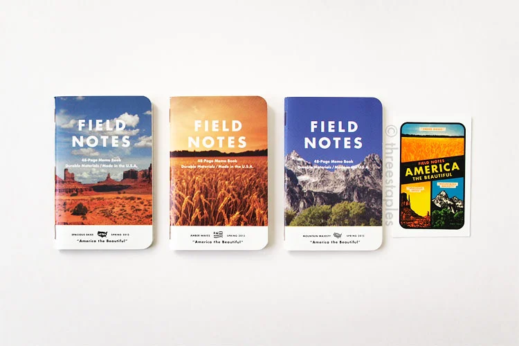
America the Beautiful is the 18th in the Field Notes Colors series. It was released in March 2013 as the spring edition but I didn’t get it until several seasons later. The photographic covers just didn’t do anything for me at first. I understood what Field Notes was going for, that vintage look with over-saturated colors and imprecise printing. It just wasn’t an instant attraction, so I passed it up several times at my local stores. Many others must have felt the same way as I did because America the Beautiful didn’t sell out until almost a year later, in February 2014. But I kept hearing good things about its body paper, and as a Field Notes fan, I felt I needed to at least give it a try. Once I did, I was instantly charmed by its quirkiness. I blame the “Spacious Skies” book, the one that’s packaged on the very front of the 3-pack with the desert landscape, for not convincing me initially. I knew the edition had three different covers but I had no idea how nice the “Amber Waves” (wheat field) book would look by itself. Had it been packaged with “Amber Waves” or “Mountain Majesty” on the front, I might have gotten this edition much earlier. Just goes to show you, there’s just something about seeing and feeling them in person that can change your opinions.
Why do I find America the Beautiful charming? It’s hard to pinpoint. I think it’s a case of the whole being greater than the sum of its parts. I like that the heavyweight cover is coated on the outside but is not too glossy, and that the inside cover is matte. I may not be a big fan of photographic covers but I find the cover layout really well balanced with just enough details. I didn't really think about it until now but somebody had to solve that challenge of putting an image in an already-well-established layout, and I think the Field Notes team makes it look easy.
And as other FN fans have noted before me, the body paper is great. It’s slightly cream-colored, a bit thicker than usual, and smooth. Much better for fountain pen users but this edition seems to be a favorite among pencil enthusiasts as well. I really like the combination of the light blue lines and the red text on the off-white inside covers, too, which is fitting for another edition paying tribute to America.


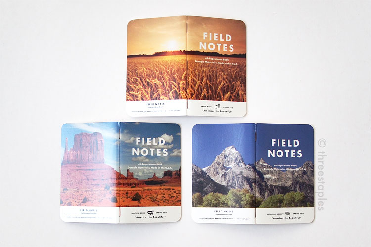
Images wrap around the back.
Firsts
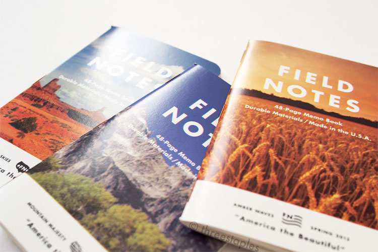
The most unique characteristic of America the Beautiful is that it’s the first time Field Notes used images on the covers, instead of flat, solid colors.
And the images wrap around the back! They are printed in over-saturated colors and off-register on purpose to look like the American vintage memo books from the 1950s and 60s. If you look closely, you can see the actual CMYK dots that make up the image, and how they’re slightly misaligned. You can see the effect more easily at the edges of the white Field Notes logotype and the white band on the bottom.

See how the magenta and cyan make up the sky color?

It's not your eyes.
I thought the images were made “fuzzy” on purpose digitally before they were printed, but no, Field Notes actually worked with their printer to have the images come out that way on press. Apparently, it was quite a challenge because modern printing machines are designed and calibrated to avoid producing such print jobs but Field Notes made it happen. According to Bryan Bedell in the 2013 recap video, they had to actually fiddle with the rollers so that they would print off-register. I am no printing expert but that sounds like a big deal.
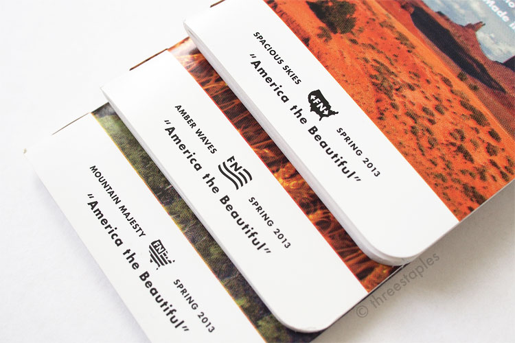
This is not the first time extra texts and graphics are added to the covers (see National Crop and County Fair) but it’s interesting to note that the images in America the Beautiful are not full-bleed and that the extra graphics are placed inside a solid white band on the bottom of each book. This style is another nod to the vintage agricultural memo books that inspired the original Field Notes. I think it really ties everything together. And check out how the “FN” icon is different in each book.
The cover stock is from Mead Westvaco; this is the first time we get this paper in Colors (and the only time, as of February 2015). It’s not the first time we encounter coated covers (see Northerly and Expedition) but America the Beautiful decidedly feels different because it’s coated only on one side and is not overly glossy.
As for the body paper (innards), America the Beautiful is in many ways similar to Traveling Salesman, an earlier edition from Fall 2012. Both editions have thicker 70#T innards that are non-white and ruled, with some blank header space at the top of each page. But while Traveling Salesman is ruled in ledger style, America the Beautiful has what you’d consider “regular” ruled lines, with 1/4" spacing. (That is the same spacing found in Traveling Salesman and later in Shelterwood and Arts & Sciences.) And America the Beautiful’s body paper is off-white (Finch), instead of green in Traveling Salesman (Mohawk Via). I would consider this the first regular ruled edition in Colors. And the first off-white edition! Because I like off-white innards and Northerly’s grey doesn’t count.
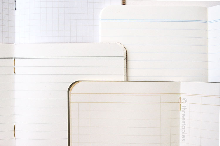
Original kraft innards (top left) compared to off-white innards, from top-right to bottom: America the Beautiful, Shelterwood, Ambition. America the Beautiful and Shelterwood use the same paper, Finch Paper Fine 70#T.
Belly band matches the inside cover. Note the decal icon on the left.
This is also the first time we see a water-transfer decal as a bonus. It's appropriately labeled FN-18a. It’s not the first time an extra item is packaged inside the 3-pack between the memo books (e.g. the temporary tattoo in Fire Spotter, Fall 2011) but unlike Fire Spotter, the bonus is advertised on the belly band on the front. Despite the instructional video on how to apply the decal, I have not used mine.

Copper staples
Last but not least, note the staples! America the Beautiful is the first edition in Colors to break the tradition of silver staples. The staples are copper-colored! This is a huge first in my book. I think the copper staples definitely add to the rustic, chunky image of America the Beautiful. Although, I should mention, they really did become rusty over the years, more so than the other editions’ staples.
Rusty copper staples
Back view

Inside view comparison: America the Beautiful (top) vs. American Tradesman (bottom). I prefer the cream color of America the Beautiful.
I may not subscribe to the whole vintage 60s look or the American road trip aesthetic but there's something very satisfying about America the Beautiful. It feels substantial yet comfortable in my hands, and all the details make me appreciate Field Notes for sticking with their vision and seeing it through.
Some fun (for me) details:
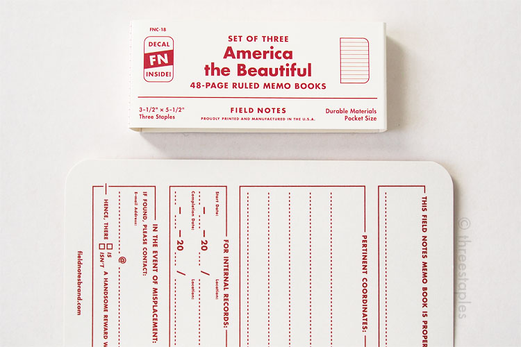
- America the Beautiful is the 18th in the COLORS series (Spring 2013).
- Item Number: FNC-18
- Edition size: 45,000 books, March 2013.
- Three different memo books per pack:
- “Spacious Skies”
- “Amber Waves”
- “Mountain Majesty”
- Cover paper: Mead Westvaco Tango in 15pt, coated on the front.
- Inside cover: matte with text printed in “Blood Red” soy-based Toyo ink.
- Paper inside: Finch Paper Fine 70#T in “Soft White,” same as Shelterwood.
- Ruled lines inside: “Looseleaf Blue” soy-based Toyo ink
- Extras: a colorful water-transfer decal “FNC-18a” made by Art Decal Corp., Long Beach, CA.
- Belly band: Matching cream color with red text and an icon for the enclosed decal
- Staples color: copper
- Film: America the Beautiful on Vimeo, shot in Illinois with this crew.
- Film: FNC-18a Water Transfer Decal Instructions, on Vimeo
- Film: An Obsessive's Guide to Field Notes COLORS: Part Five (2013) on Vimeo
My Favorite “Practical Applications”:
- #11. Bird Call Cheat Sheet
- #15. Summits Summitted
- #24. Bathtub Gin Recipe

Did you need convincing to get America the Beautiful or was it a no-brainer? Which book among the three is your favorite? I think my ranking for this edition will constantly change. These days, it floats somewhere between #11 and #16, which is my not-head-over-heels-but-definitely-not-meh range. But who knows how things will change as more editions are released!